The Dashboards module, which includes maps, represents a key feature for the product, and this project was initially driven by the need for an Angular JS upgrade to its latest version. EnergyCAP is an energy and sustainability ERP that brings cross-functional teams together in a single platform, to drive cost-effective and responsible utilisation of finite resources.
Added value
Visual Design
UX Design
Documentation
General details
Feature update
Timeframe: 9 weeks
Deliverables
UX Research results
UI Design
Devs documentation
Tools (main)
Miro
Figma
Confluence
The Kickoff
The colour scheme of the charts does not honour accessibility standards.
Lean UX Canvas & first things to know
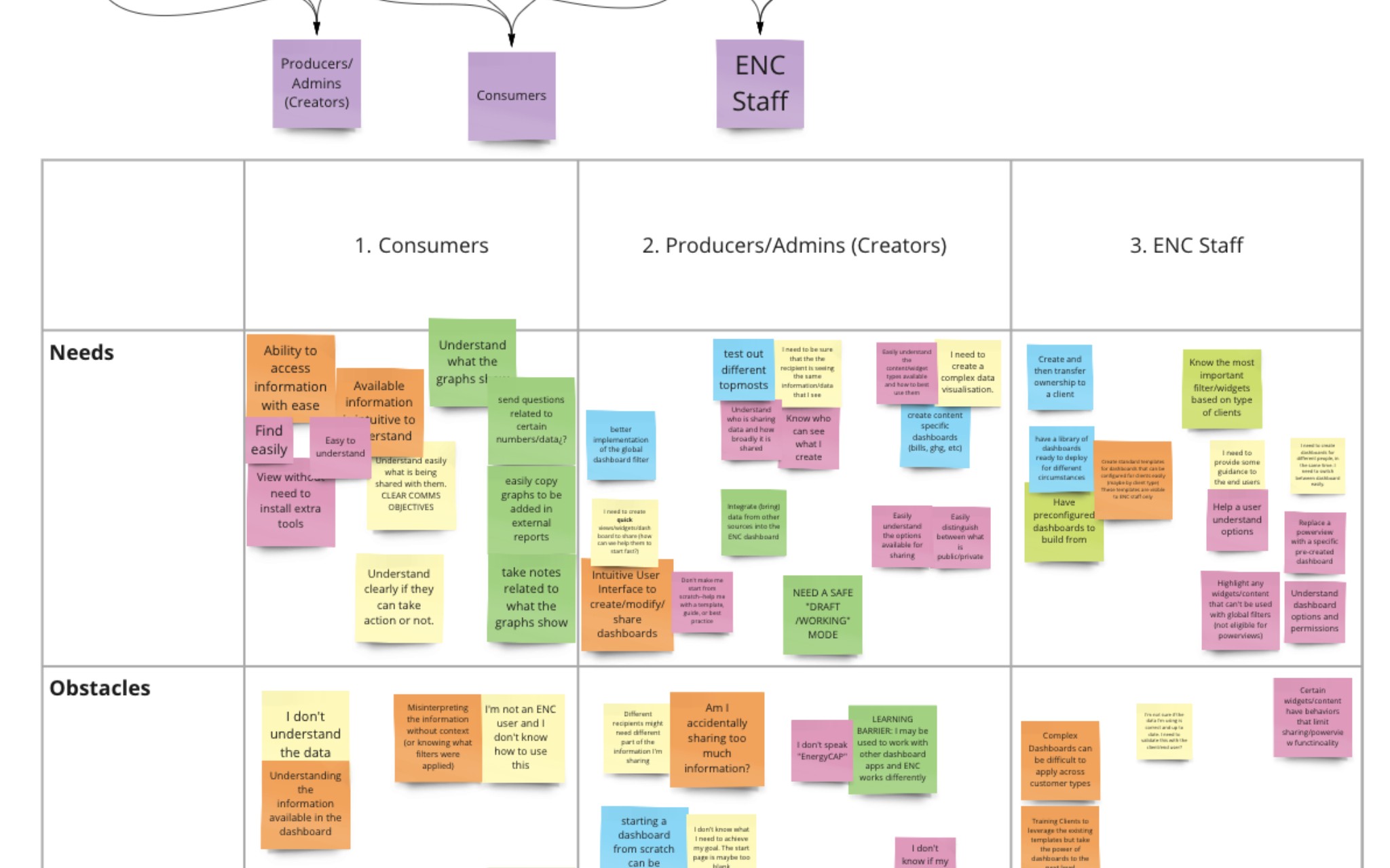
Using a custom Lean UX approach we took the first steps into the project: understanding business problems, and outcomes, and empathising with users and other players.
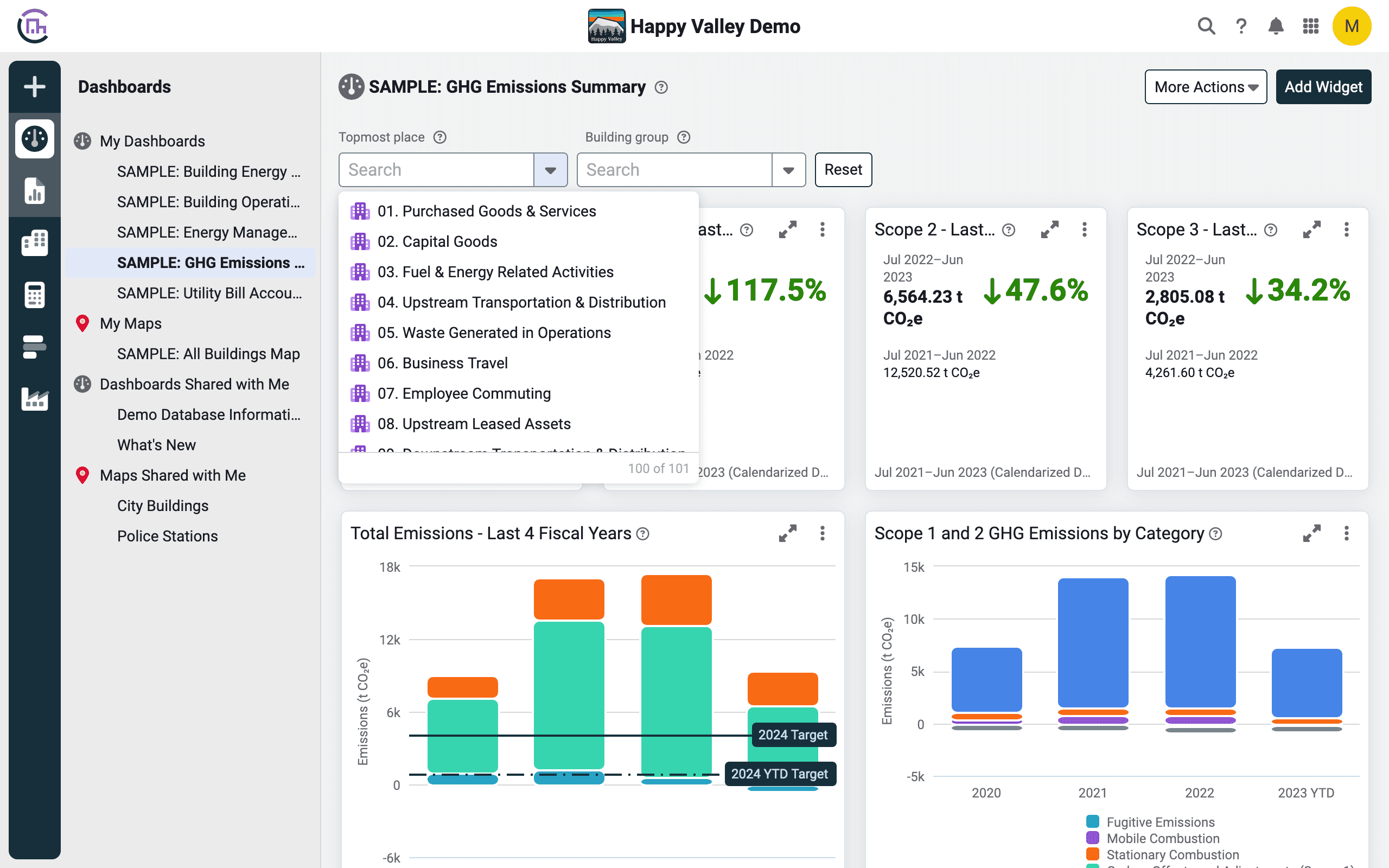
Besides the Angular update that was mandatory, the main goal was extended to improve the overall user experience for data visualisation, both in dashboards and maps, following the pain points and issues found. The high-level updates include dashboards and widgets, maps, and managing public and sharing options.
The expected result is a visually accessible and usable environment able to display complex data and provide users with on-the-spot information when needed, together with expanded sharing options.
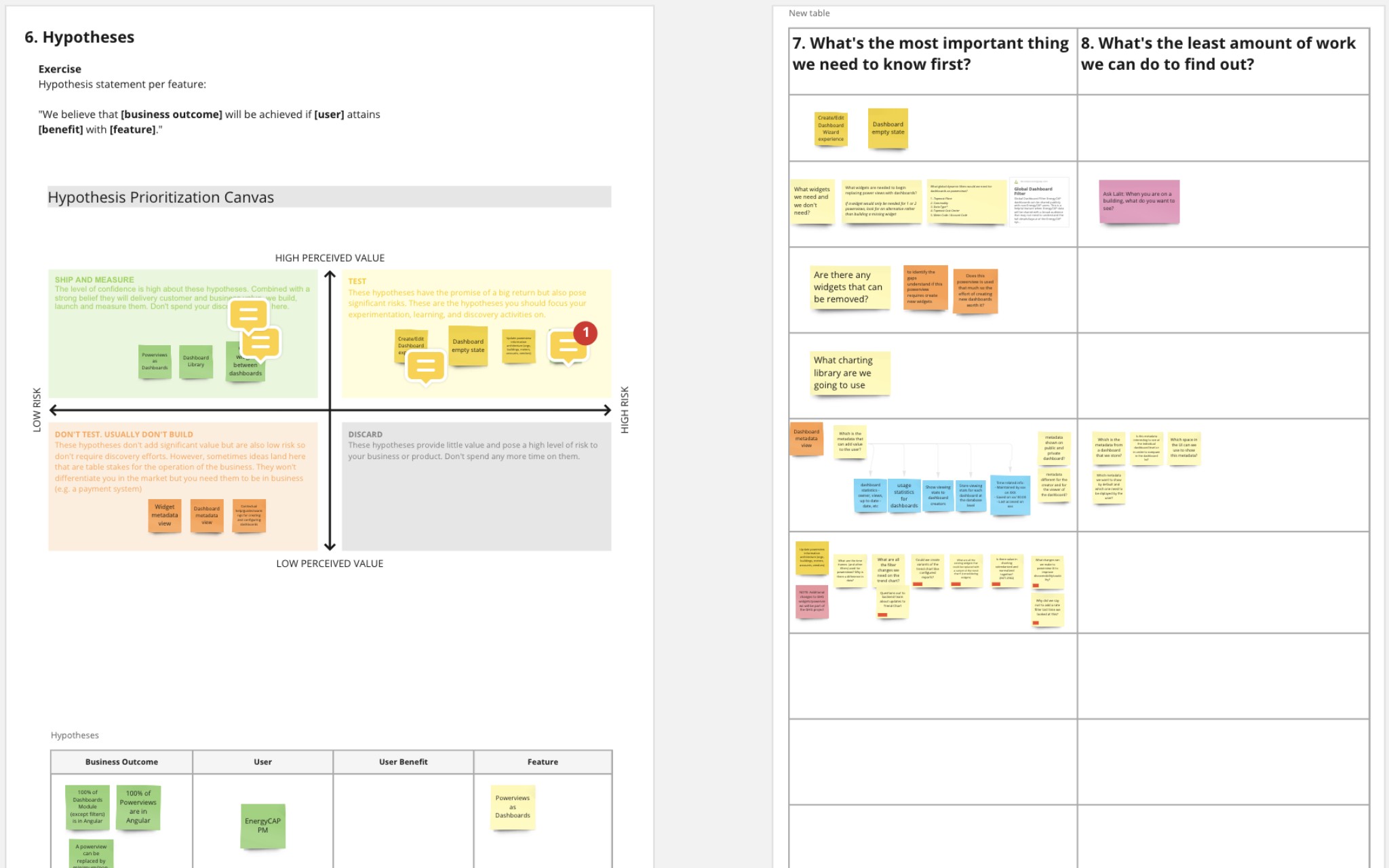
Thanks to an ever-evolving hypothesis prioritisation matrix we were able to prioritise research on the way, at the same time that we laid down the first things to know and mid-term planning.
Ideation and first sketches
Ideation
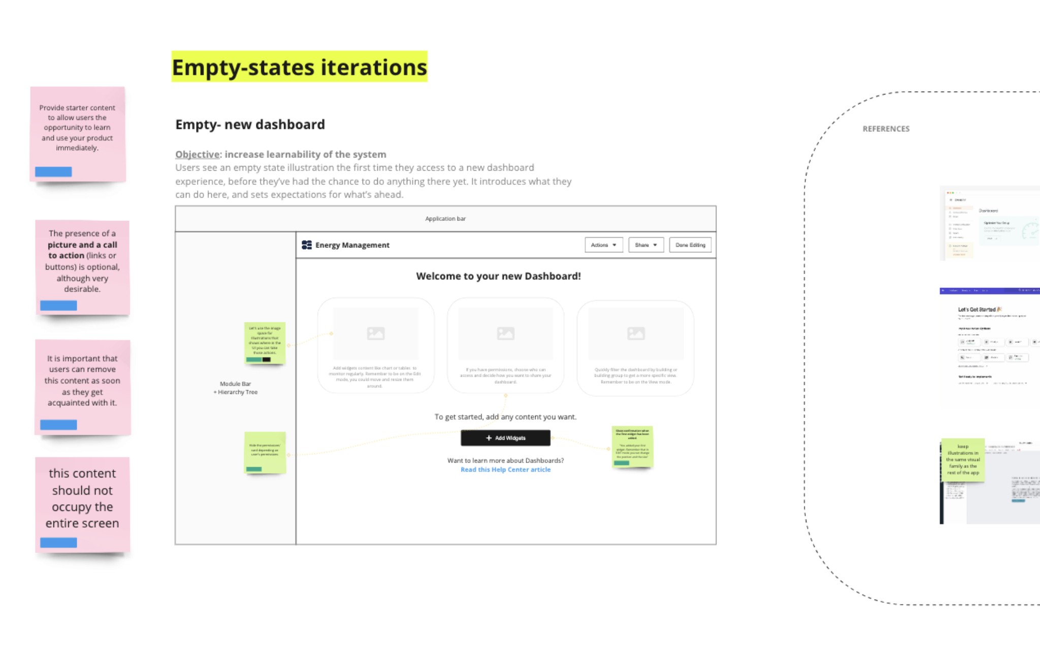
Empty states ideas
First sketches
First sketches
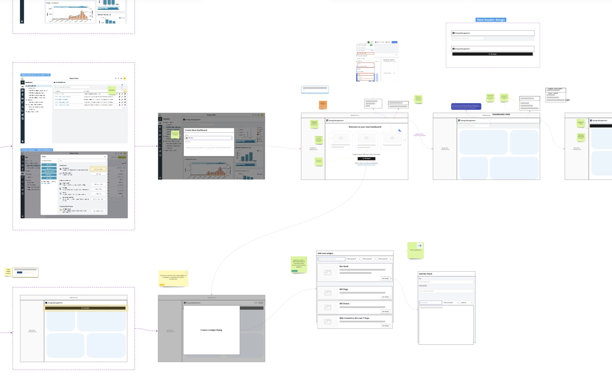
It's Figma time! Widgets, new user flows and maps
01 → Users create, add, and share
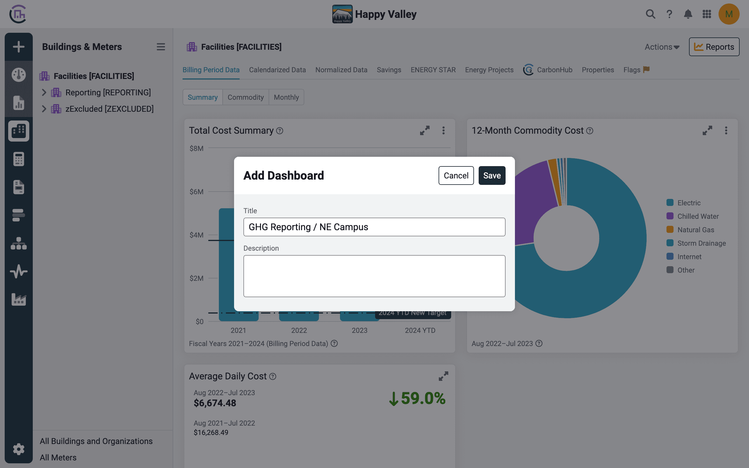
Updated dialog
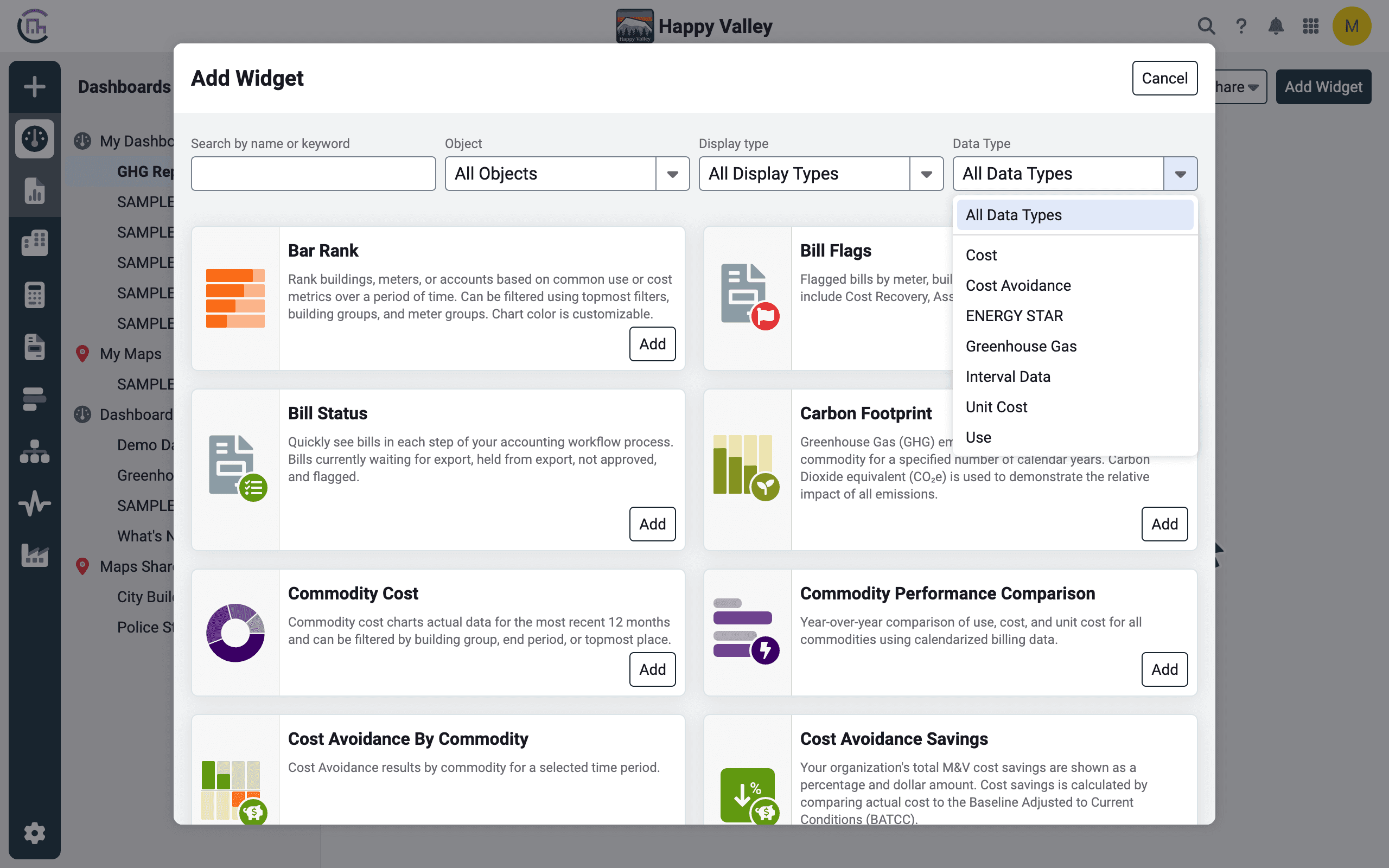
Improved widget creation
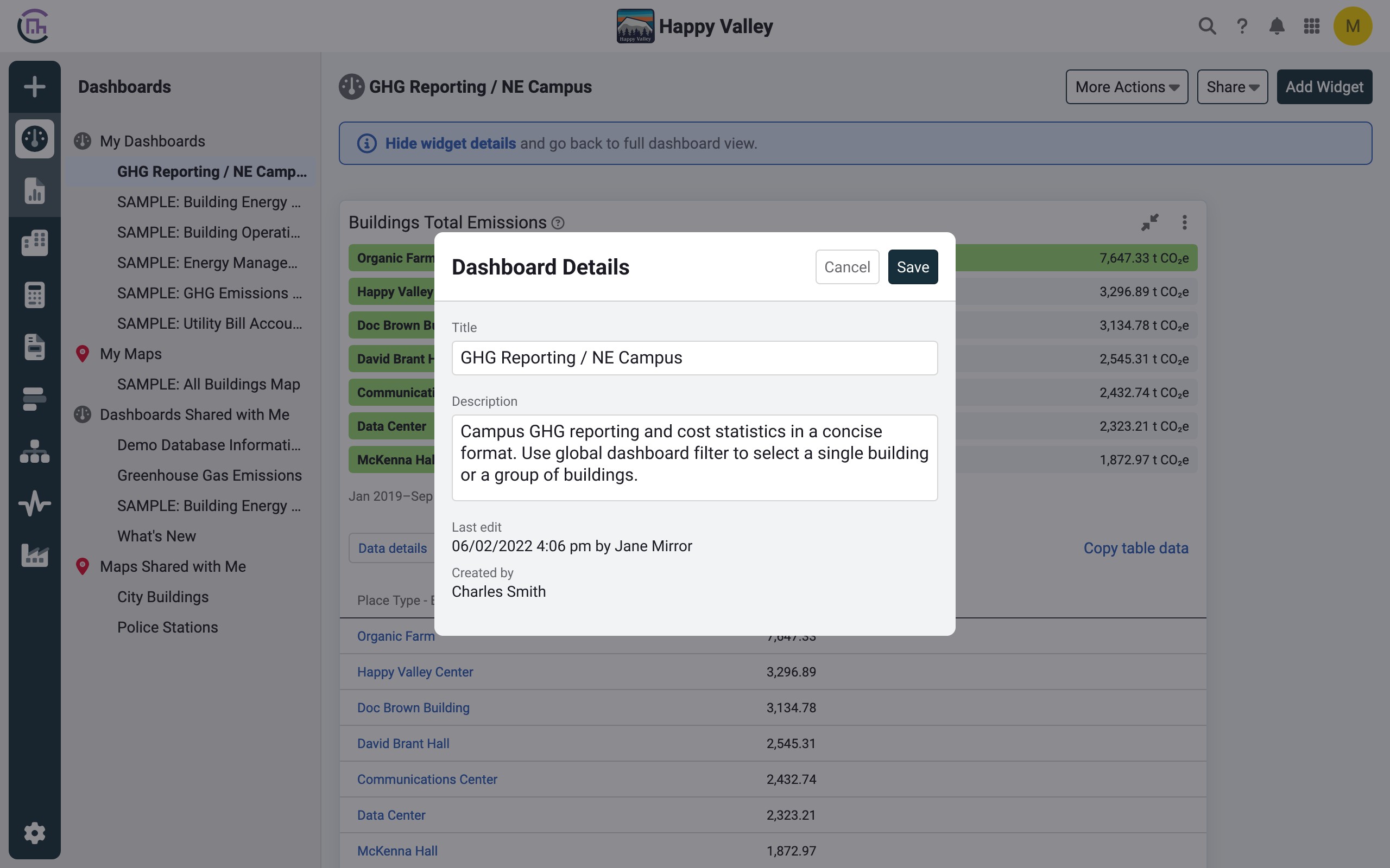
Dashboard details
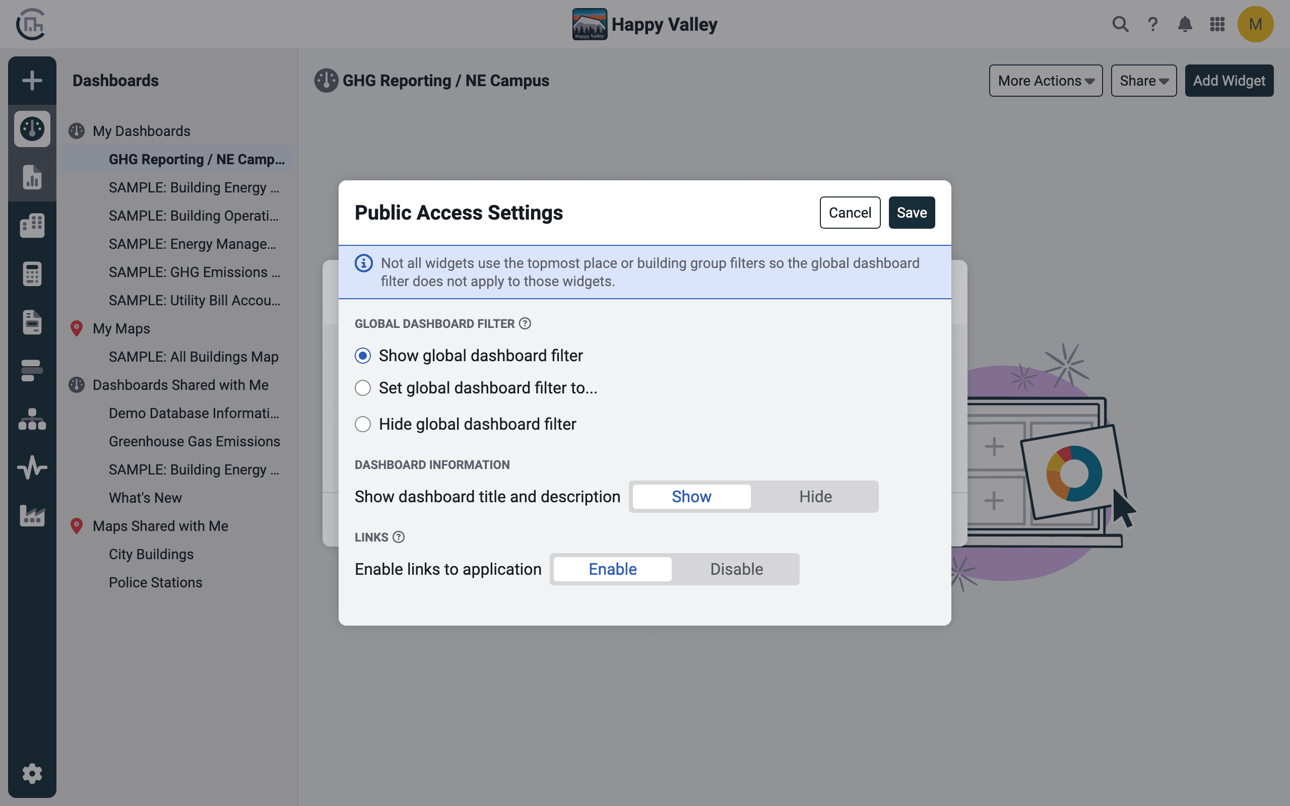
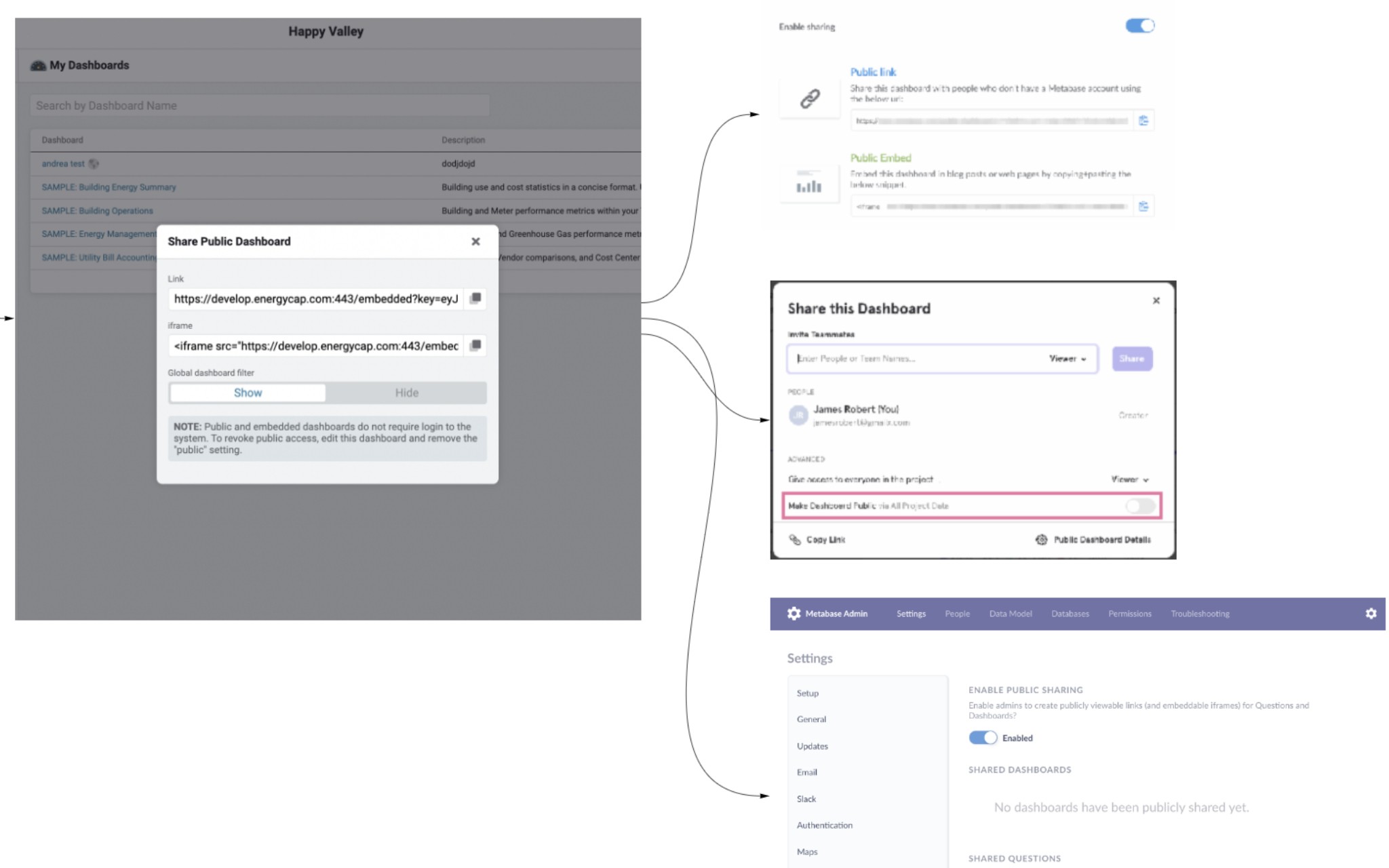
Improved public access settings
02 → Users view, use, and edit
Dynamic toasts
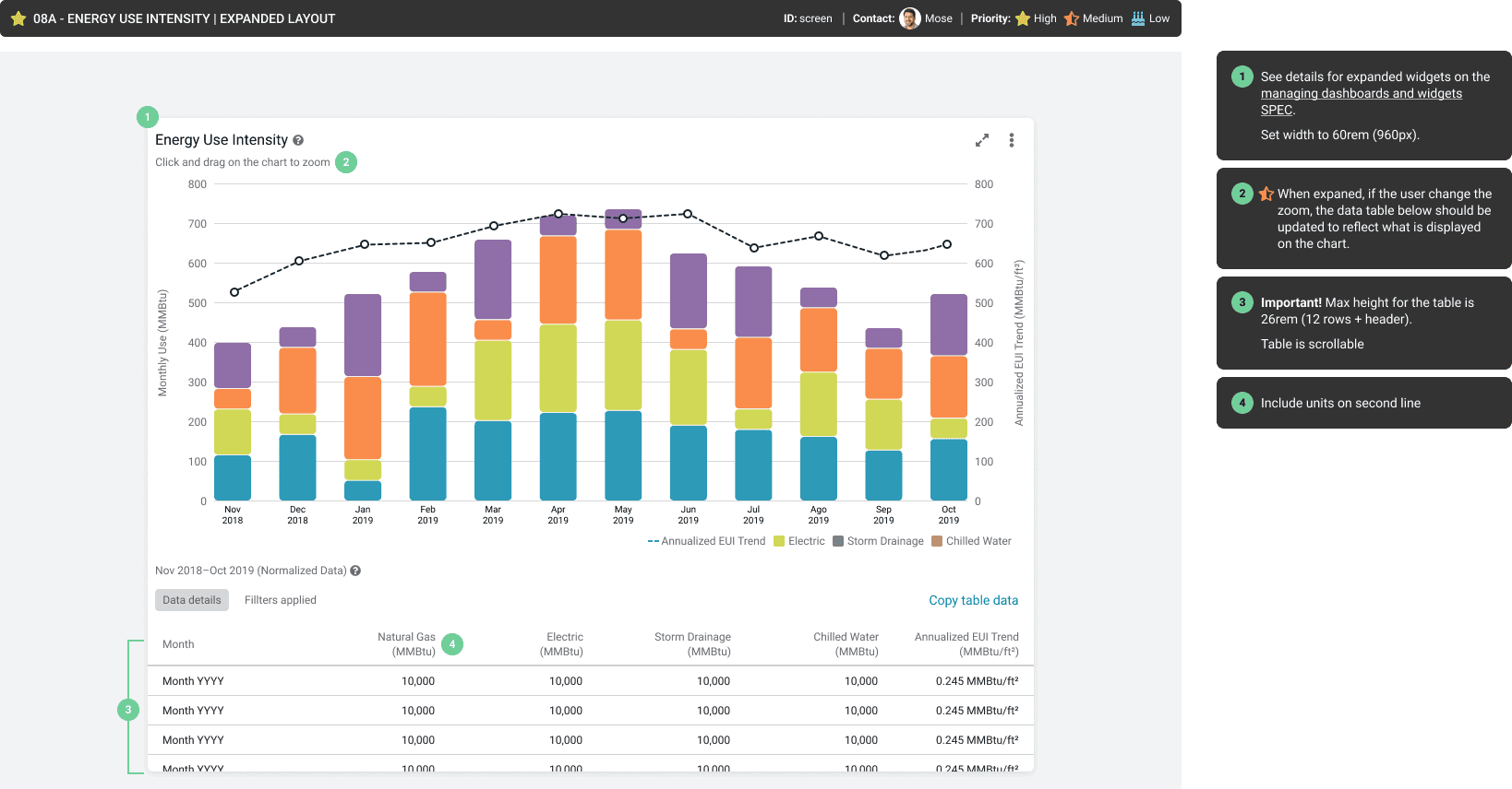
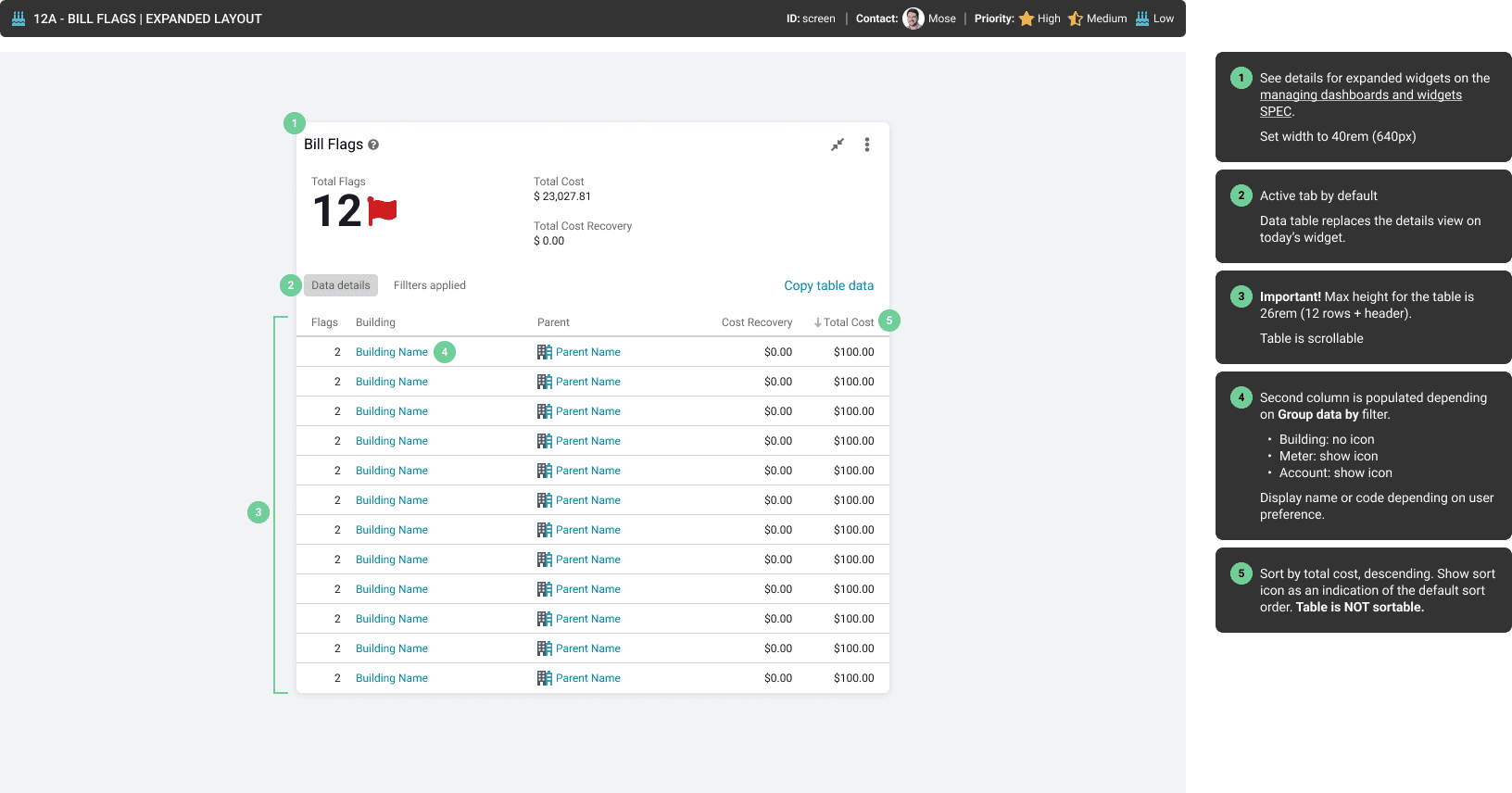
Expanded widget view
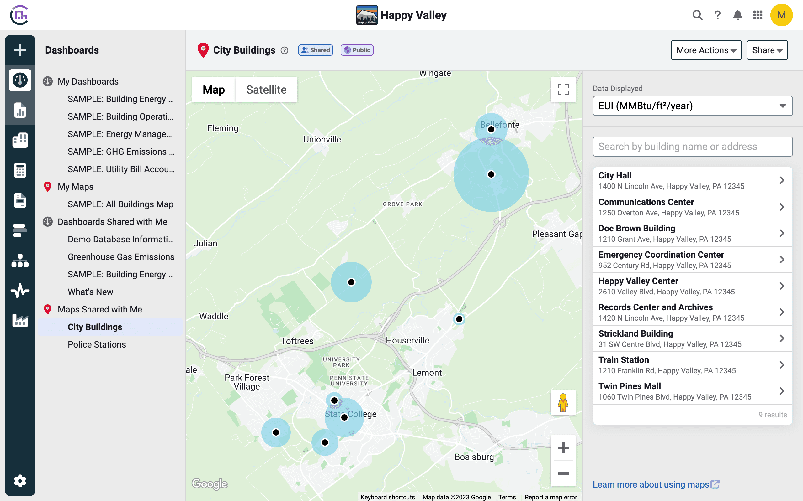
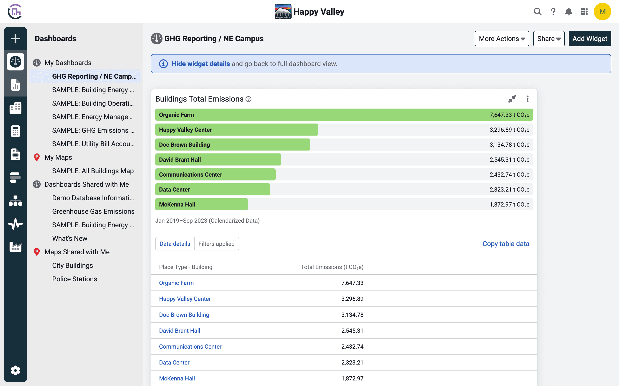
Data sensitive pins on maps
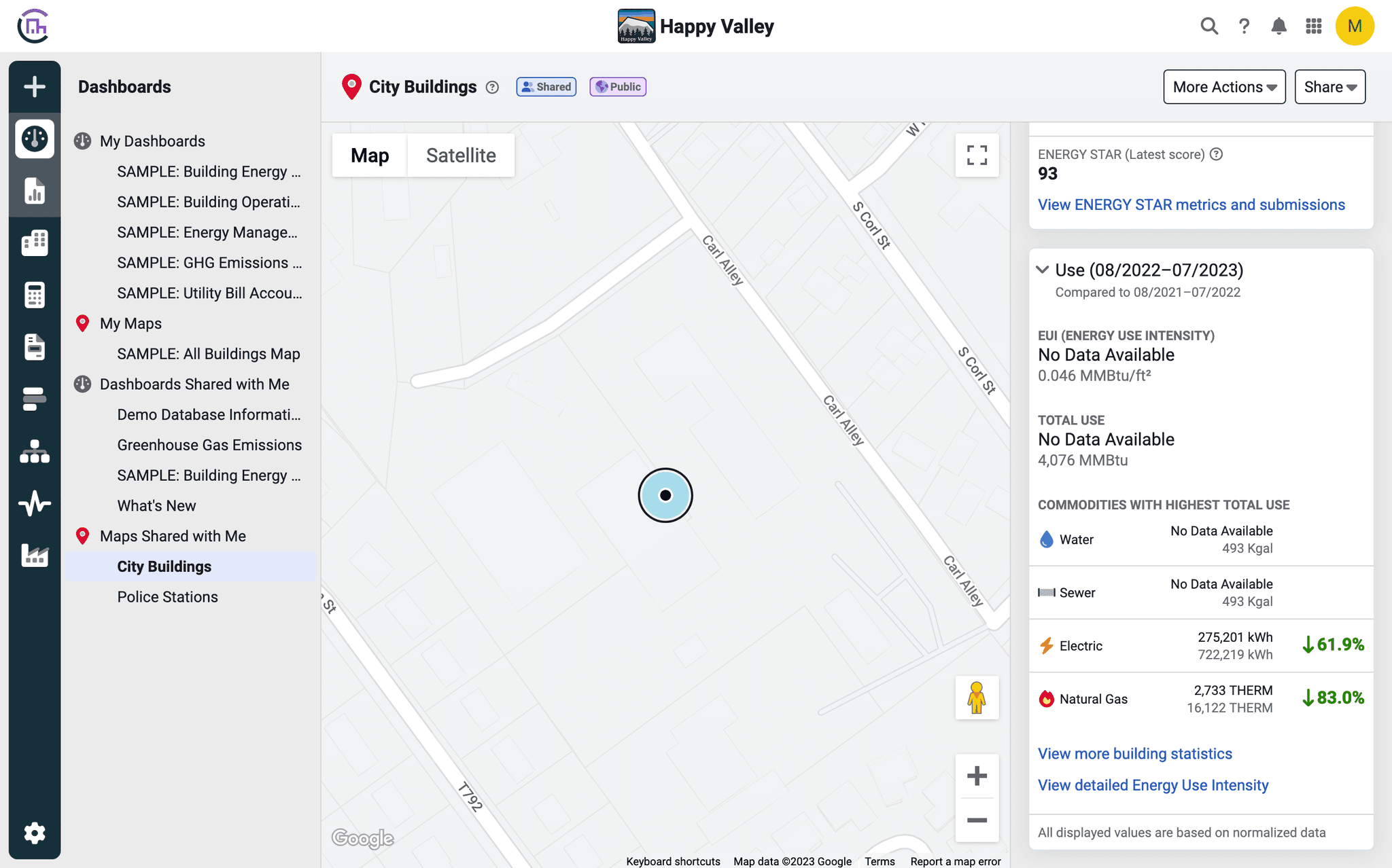
Improved detailed information for buildings
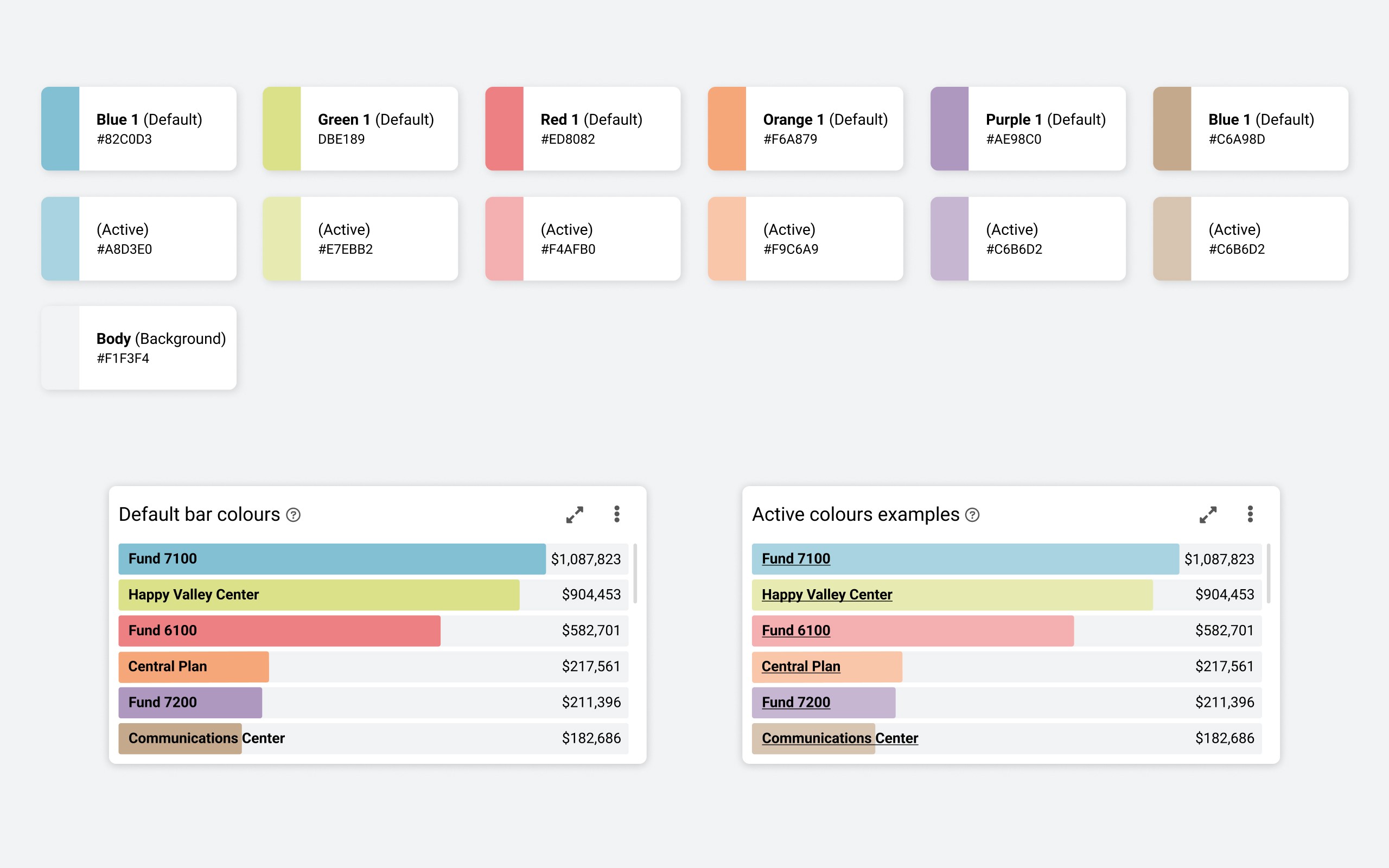
New color palette
Development
Documentation for developers
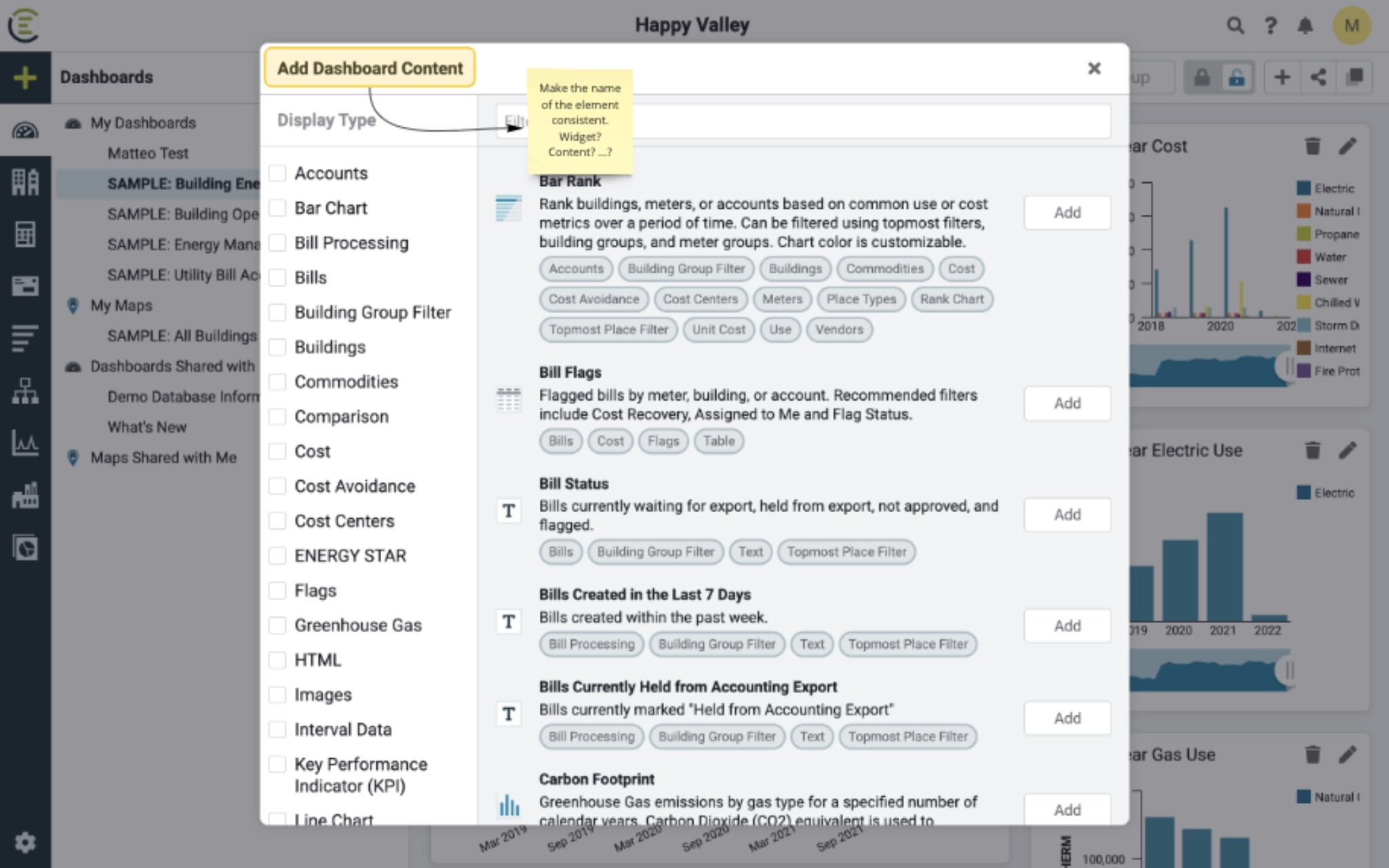
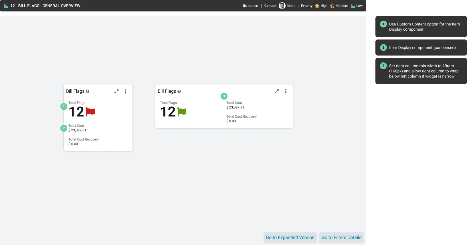
Besides the usual prototypes to test interactions and flows, I also created a prototyped document with Figma to present and hand off the documentation to the developers. This is an in-house process that we found particularly beneficial in a wide project like this one.
The main advantages are:
Embedded possibilities in other platforms as a prototype (Notion, Confluence, Jira, …), make it easily available to all the teams.
No need to deep dive into the design file, as the prototype uses on-screen notes to identify updates and new items.
Figma sidebar navigation panel helps other parties to quickly find what they need.
Widget details
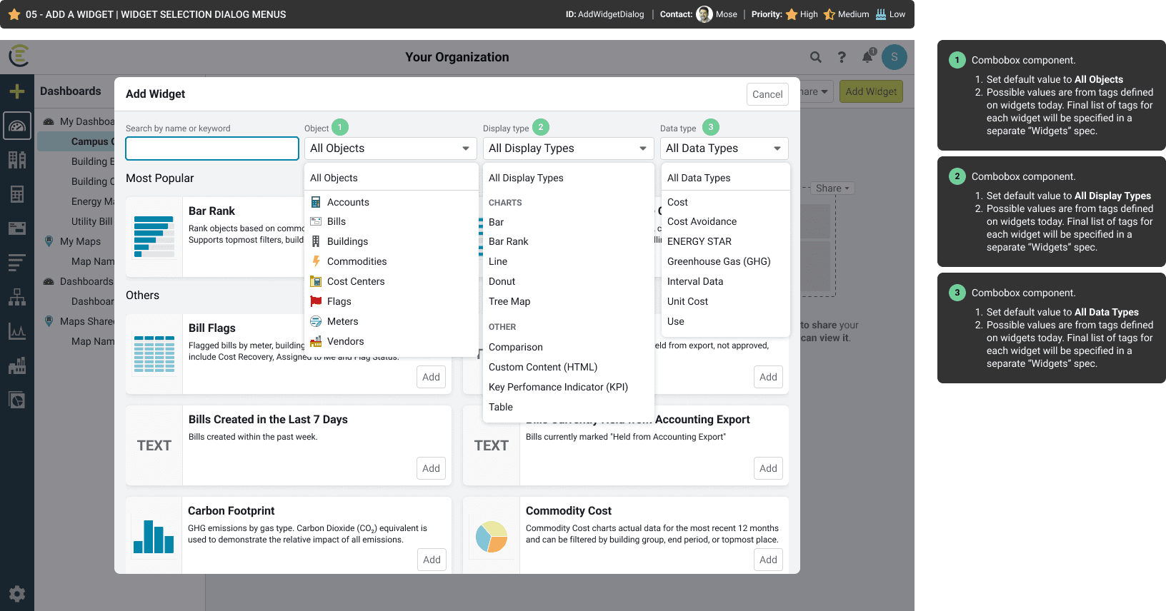
Add widgets dialog
Responsive widget details
Widget details
Future considerations
Design debt and descoped items
During the design process, a lot of ideas surfaced but not all of them got to see the light because of the scope, technical feasibility, and effort involved. However, the team had all the important information logged in Miro and or Figma, and some of these ideas even made it to the Jira board.
The simple way we found to keep an organised log for our future selves was to create and close Jira tickets for each descoped idea while marking them as "Won't do". This way, when the project is reviewed or post-researched, it will be easy enough to browse and find ideas that did not make it to the finish line.