EnergyCAP is an energy and sustainability ERP that brings cross-functional teams together on a single platform to drive cost-effective and responsible utilisation of finite resources. Because of its nature, the ability to report easily is essential for the product, and the improvements included in this project solved both user and business issues.
The application is complex, and organised into modules and folders. This structure allows users to customise their experience and offers scalability in licences and client customisation.
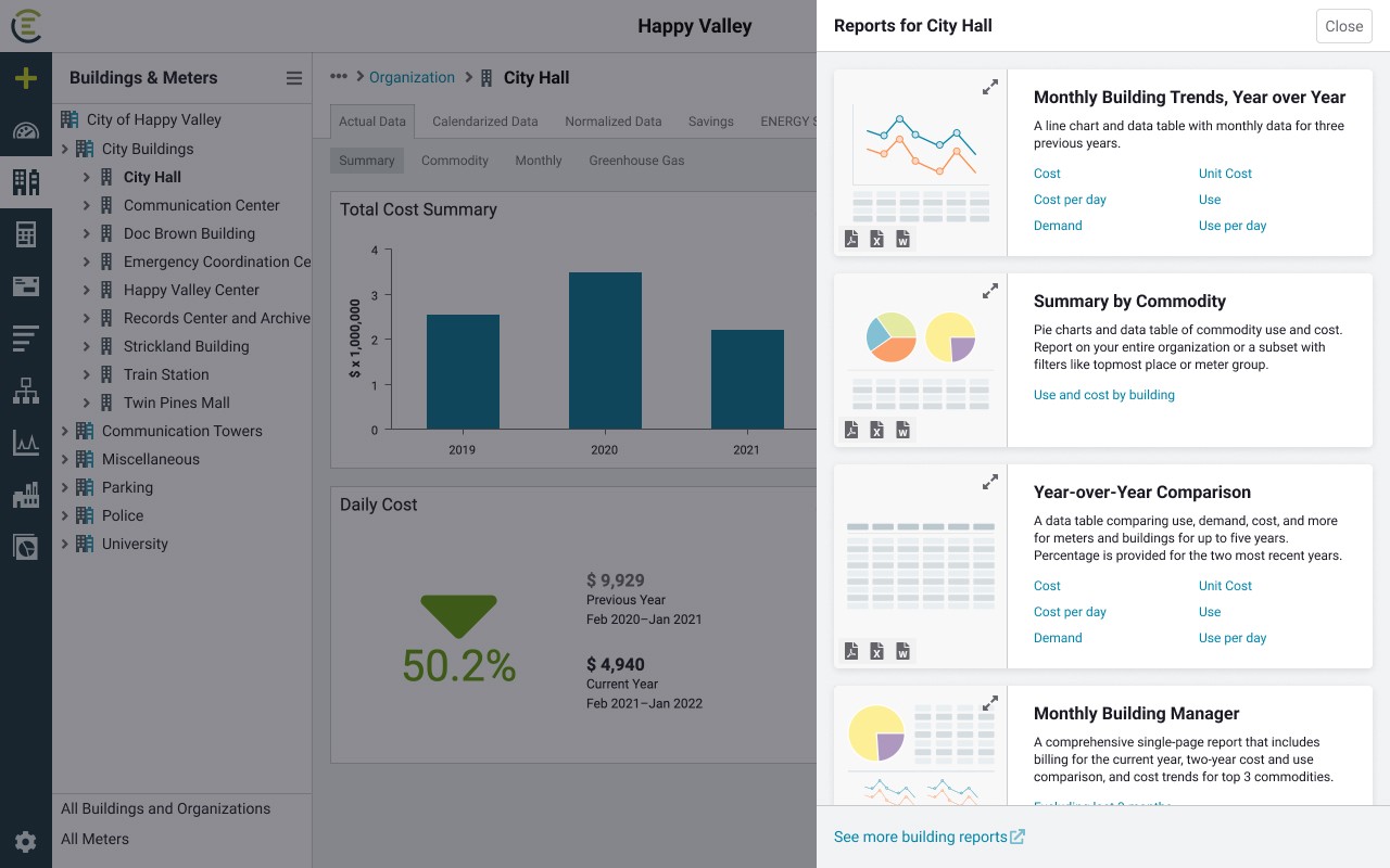
This new feature incorporates the possibility to run reports at any level of the hierarchy, regardless of the user's access to the classic reports module in the application. The project was initially driven by a new contract need, but it has been added for all existing customers due to its high value.
Added value
Research
UI & Assets
Documentation
General details
New feature
Timeframe: 6 weeks
Deliverables
Tools (main)
Figjam
Figma
Confluence
Empathise & Define
Users and business problems
Following a design thinking process, the project began with a kick-off meeting to comprehend the initial context, the business problems, and the expected outcomes. The team collaborated with Figjam during these initial stages.
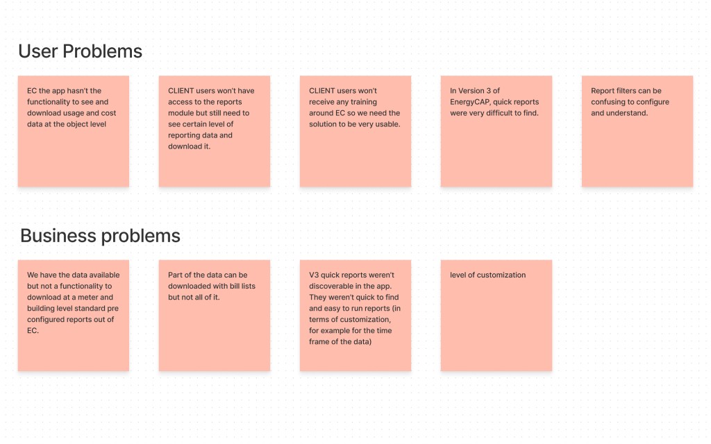
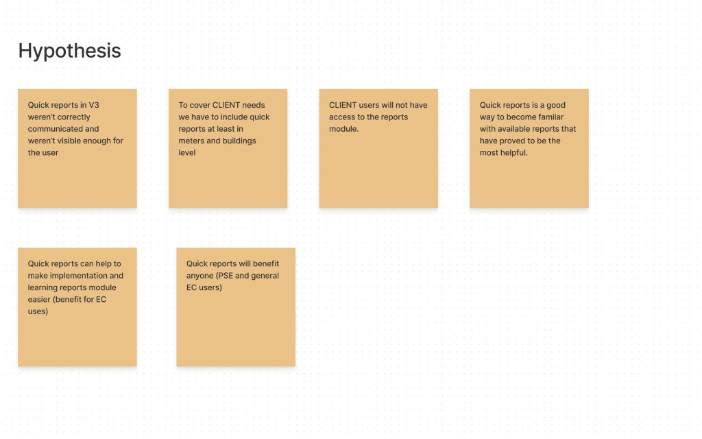
This first part of the process helped us define and validate problem statements:
This causes problems for the client's users who need to see and download this data and will not have access to the reports module
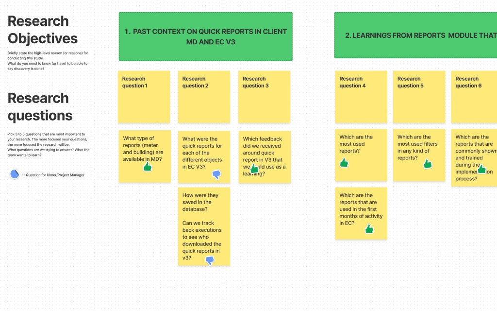
RESEARCH OBJETIVE, AUDIENCE, AND PLANNING
To focus efficiently on the most valuable items, the UX specialist and I created the first research clusters, both in terms of audiences and research areas. In the next steps, we laid down and then validated these with the broader team and the product manager so that we could grab additional feedback and diverse perspectives before digging into details and interviews.
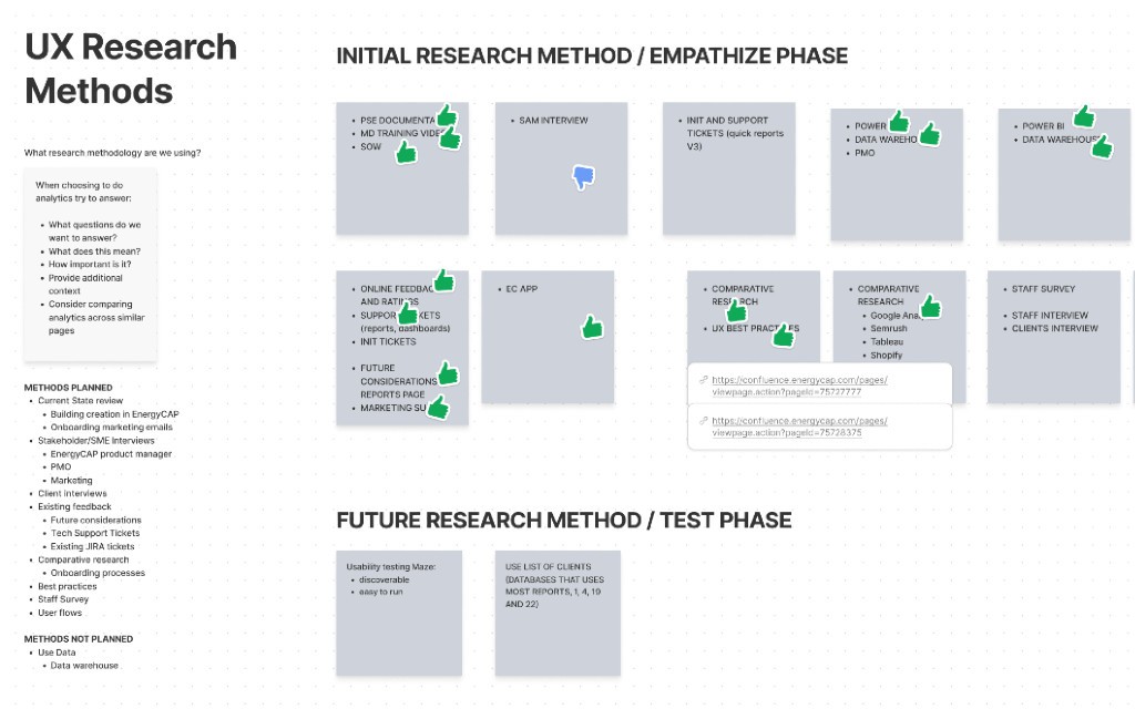
INTERVIEWS AND RESEARCH RESULTS
The interview process was executed using recorded Zoom meetings and follow-up questions via email when people provided availability.
From time to time, we would share as well quick ideas and assumptions with the internal tech leads and the product manager to ensure feasibility and keep the focus on business actionable items.
Audience
Internal tech leads - to understand the past context
Existing customers - to identify issues and discover opportunities
New client staff - to understand users needs, priorities, and pain points of their current system
Internal project managers - because they are in charge of the implementation process and drive the conversation with the clients
Focus areas
Learn about the current client environment
Understand the hows and the whys of the feature when this was available in the legacy environment
Learnings from the application's current reports module. What is valuable to keep? What should we improve? Which best practices can we carry on and expand to the new feature?
How can we improve the way users discover, find, and use the new quick reports feature?
What did we learn?
The steps to run a report in the application are difficult to understand. Reports' filters are not straightforward enough.
Users highlighted that more than once they get the wrong reports, format, and/or data.
Users need to know which file formats are available for each report.
Users need to run a report directly from an object, without navigating away from that screen. Now they can't.
The reports in the application are very wide in terms of the data the address, it would be time-saving to create preconfigured options, along with the current configuration.
It's difficult for the users to run a report from a building or meter, as they need to change modules and the environment is different.
The sample images we provide are confusing to users. It shows data, but it's not related to what the user is selecting. It's not clear that the image is just a sample.
Users don't need a lot of options for quick reports, there are clear patterns across clients that could help to focus on valuable items.
From a technical point of view, we shouldn't have any major problems implementing the new feature as it builds on top of the current development.
Ideate
Ideation and first sketches
We created a list of 9 valuable items to address by cross-checking the initial problems with the research learnings. After team validation, we decided to build our first ideation session around this list using How might we? questions.
Thanks to this approach, we were able to ideate efficiently and start sketching out quick ideas that we could easily validate or discard. This process was run in a moderated environment using Figjam, in which the team had 5 minutes to simultaneously write or sketch ideas about a specific HMW question, and then each person had 2 minutes to speak and enter into details or share thoughts and rationales.
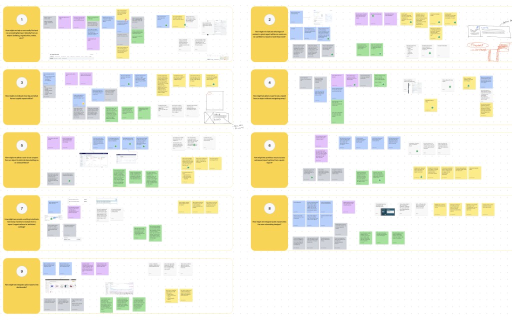
At the end of the session, the design manager and I had a second round of evaluation to determine the ideas that would be wireframed and designed, and the reasons behind the ones that would not make it to the finish line.
The decisional framework took into account three main boundaries:
This idea solves a user and/or business problems directly
This idea is feasible from a technical point of view (as the product is at the moment)
This idea can be built using our design system and/or with a reasonable update
In the next stage, we started creating low-fidelity designs and user flows around the validated items.
Design
iterations and design decisions
During the ideation session, the team aligned on many valuable ideas, probably driven by existing behaviours in other platforms and the clear statements of the HMW questions. As a result, we were able to dedicate quality time to design the UX process, digging into usability problems and addressing almost all the issues that surfaced during the research stage.
What are main achievements?
Easy-to-find and scalable solutions to run a quick report from any object in the application.
Improved experience to view sample reports and their file formats.
Preconfigured reports available to users, defined by their usage data and main categories.
Flexibility to edit the filters of a preconfigured quick report if users decide so.
New sample images to avoid confusion and show general format and charts, but not fake data
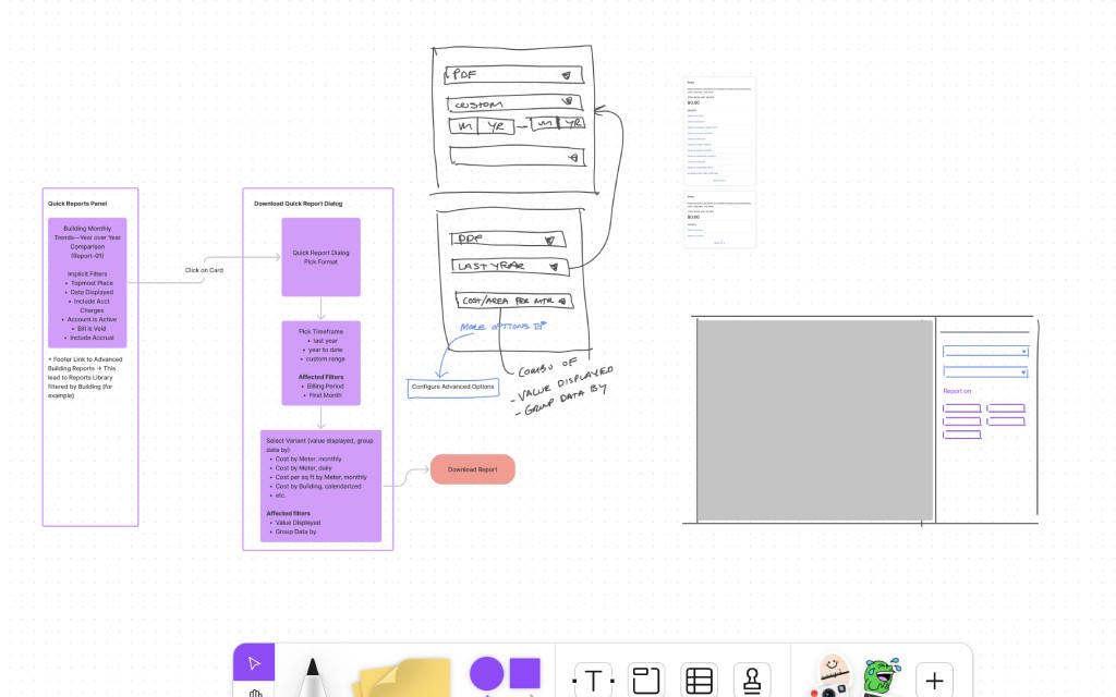
Quick Reports side panel
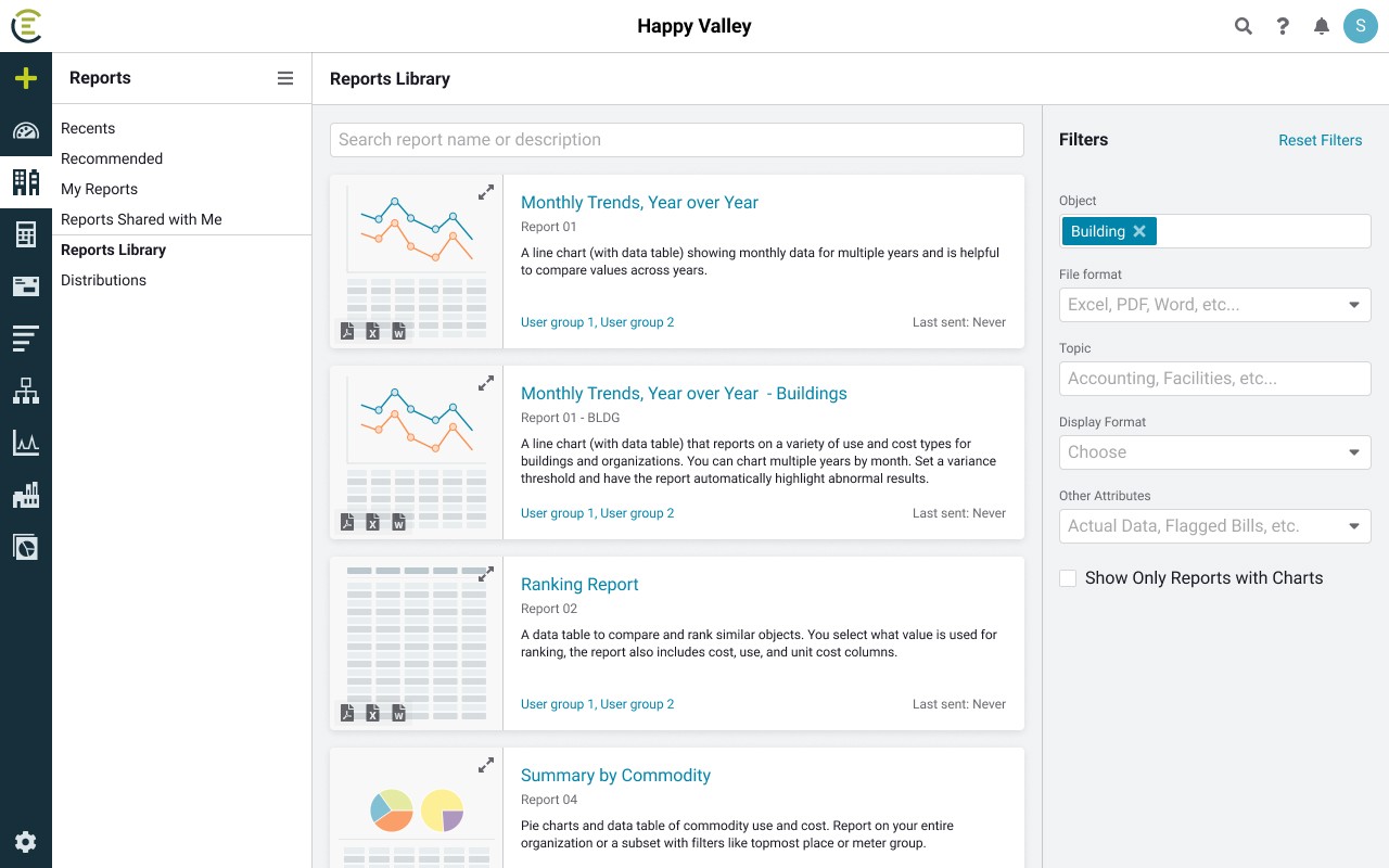
Improved reports library
figma thumbnails library & sample images
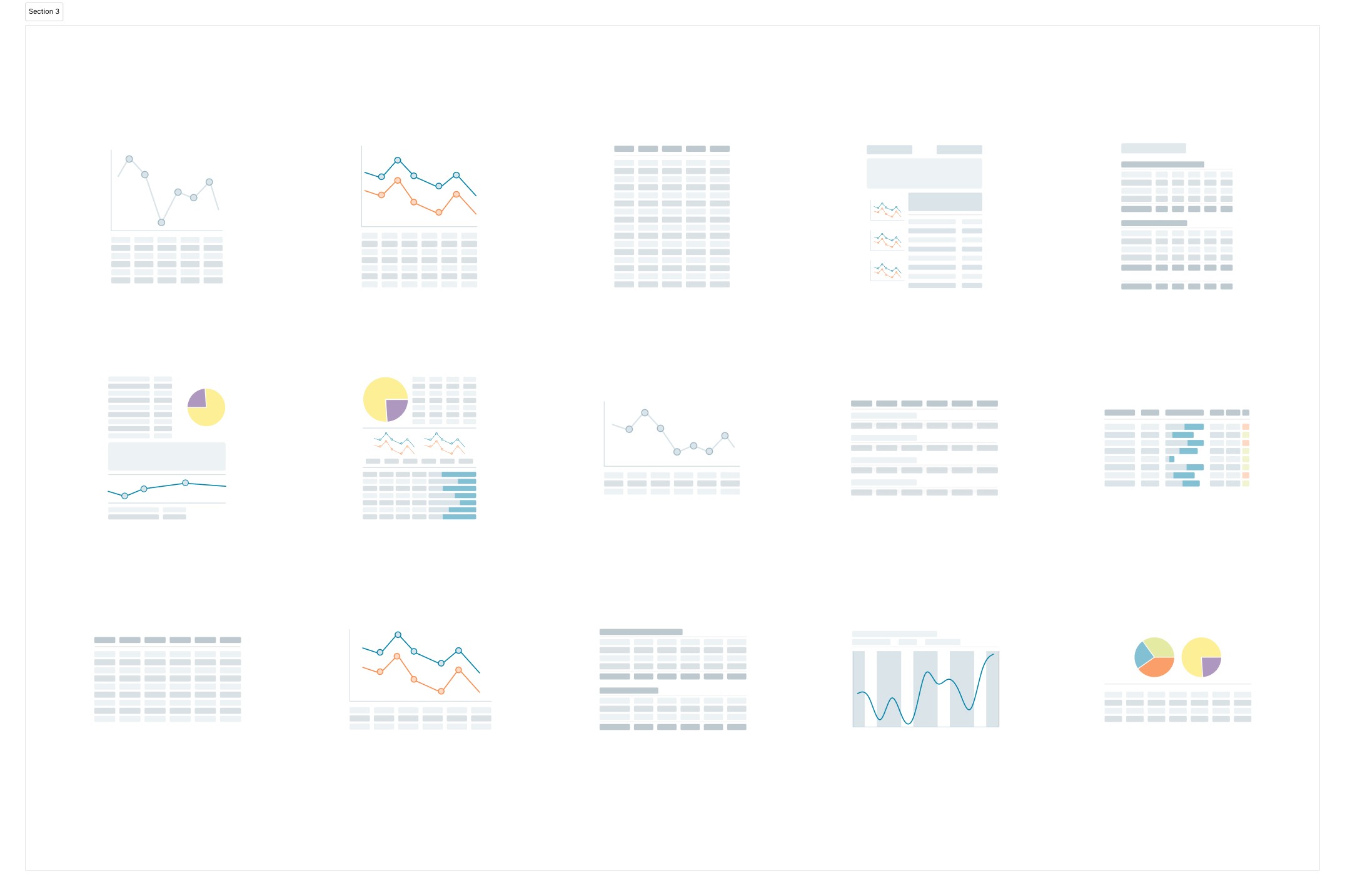
Besides adding the new components to the design system, I was able to create an additional Figma library for the team to use in further designs and iterations of this feature, or related ones.
The challenge in this case has been the design of the thumbnails themselves, due to the complexity of the data involved. To avoid endless iterations, I went through a 1-to-1 simplification of each report which was feasible due to the limited number of items.
This capsule library contains all the new thumbnails of the reports and is organised by object type, to provide a quick filter and all the available options to use while designing.
I find this type of practice really beneficial for the team as it allows us to quickly share assets and items across projects. There is no need to modify and go through the validation process of updating the main design system, as they will be available as nested instances in the main components.
Thumbnails examples
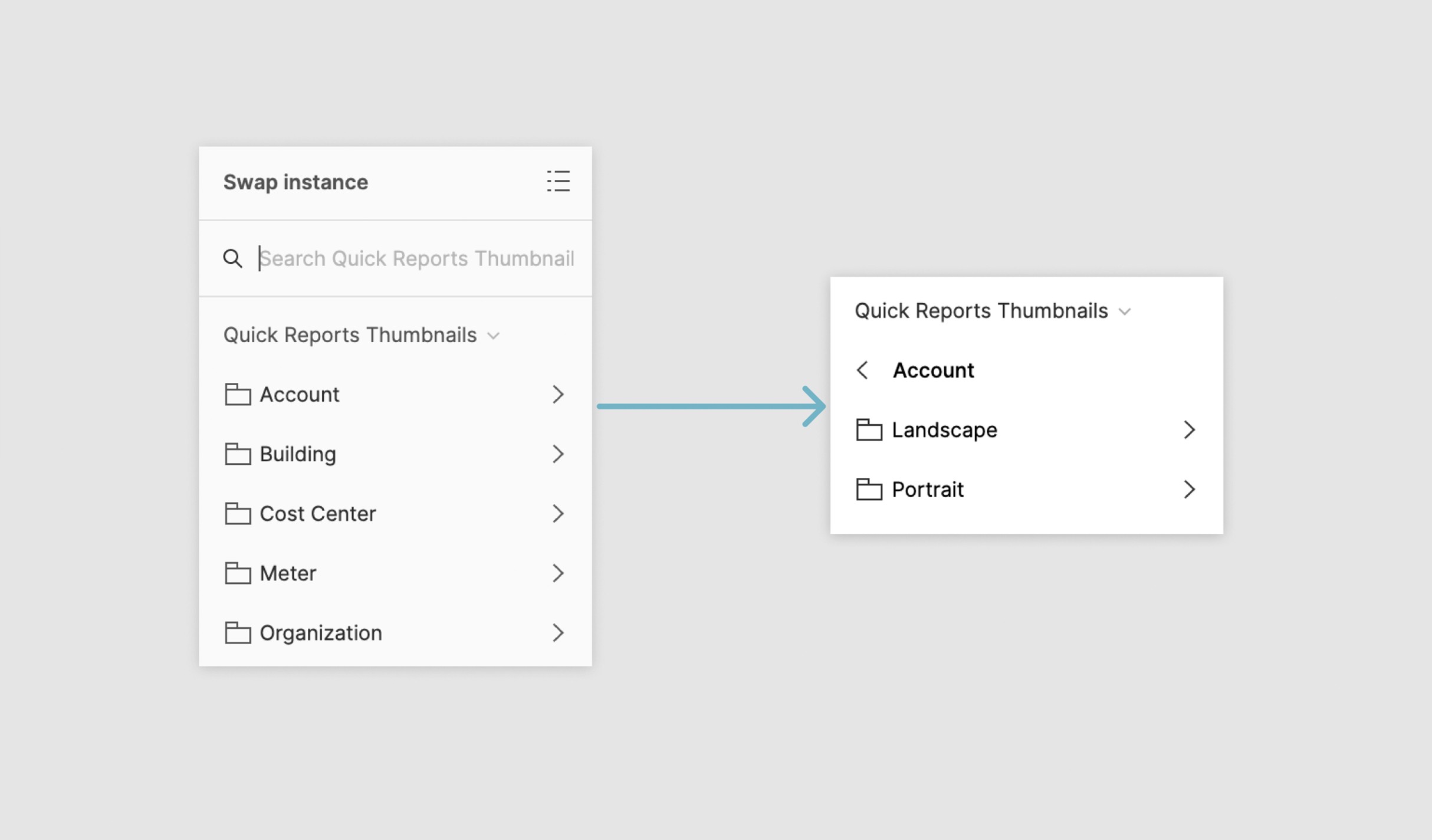
Component structure
Development
documentation for developers
Besides the usual prototypes to test interactions and flows, I also created a prototyped document with Figma to present and hand off the documentation to the developers. This is an in-house process that we found particularly beneficial.
The main advantages are:
Embedded possibilities in other platforms as a prototype (Notion, Confluence, Jira, …), make it easily available to all the teams.
No need to deep dive into the design file, as the prototype uses on-screen notes to identify updates and new items.
Figma sidebar navigation panel helps other parties to quickly find what they need.
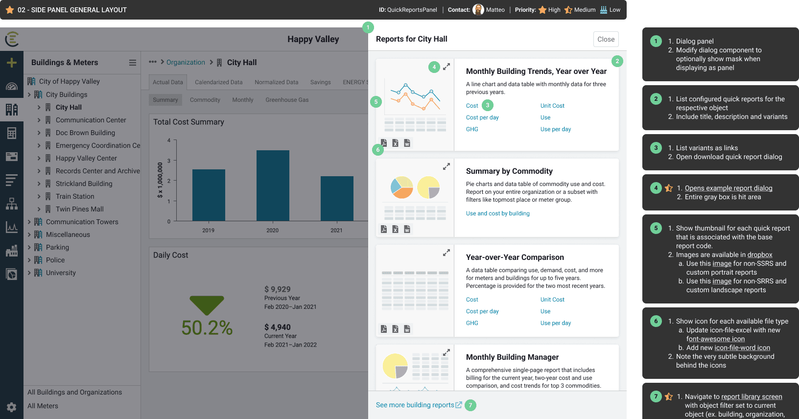
Quick reports side panel
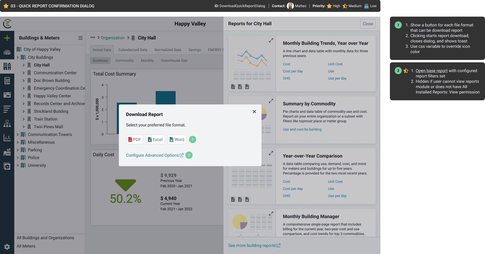
Download dialog
Future considerations
Design debt and descoped items
During the design process, a lot of ideas surfaced but not all of them got to see the light because of the scope, technical feasibility, and effort involved. However, the team had all the important information logged in Figjam and or Figma, and some of these ideas even made it to the Jira board.
The simple way we found to keep an organised log for our future selves was to create and close Jira tickets for each descoped idea while marking them as "Won't do". This way, when the project is reviewed or post-researched, it will be easy enough to browse and find ideas that did not make it to the finish line.