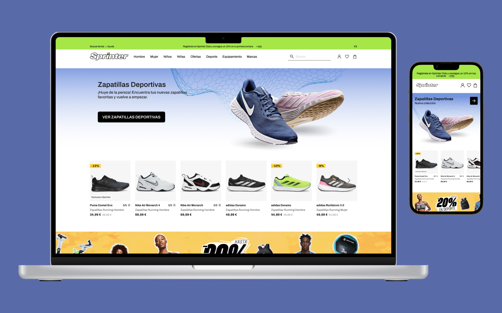
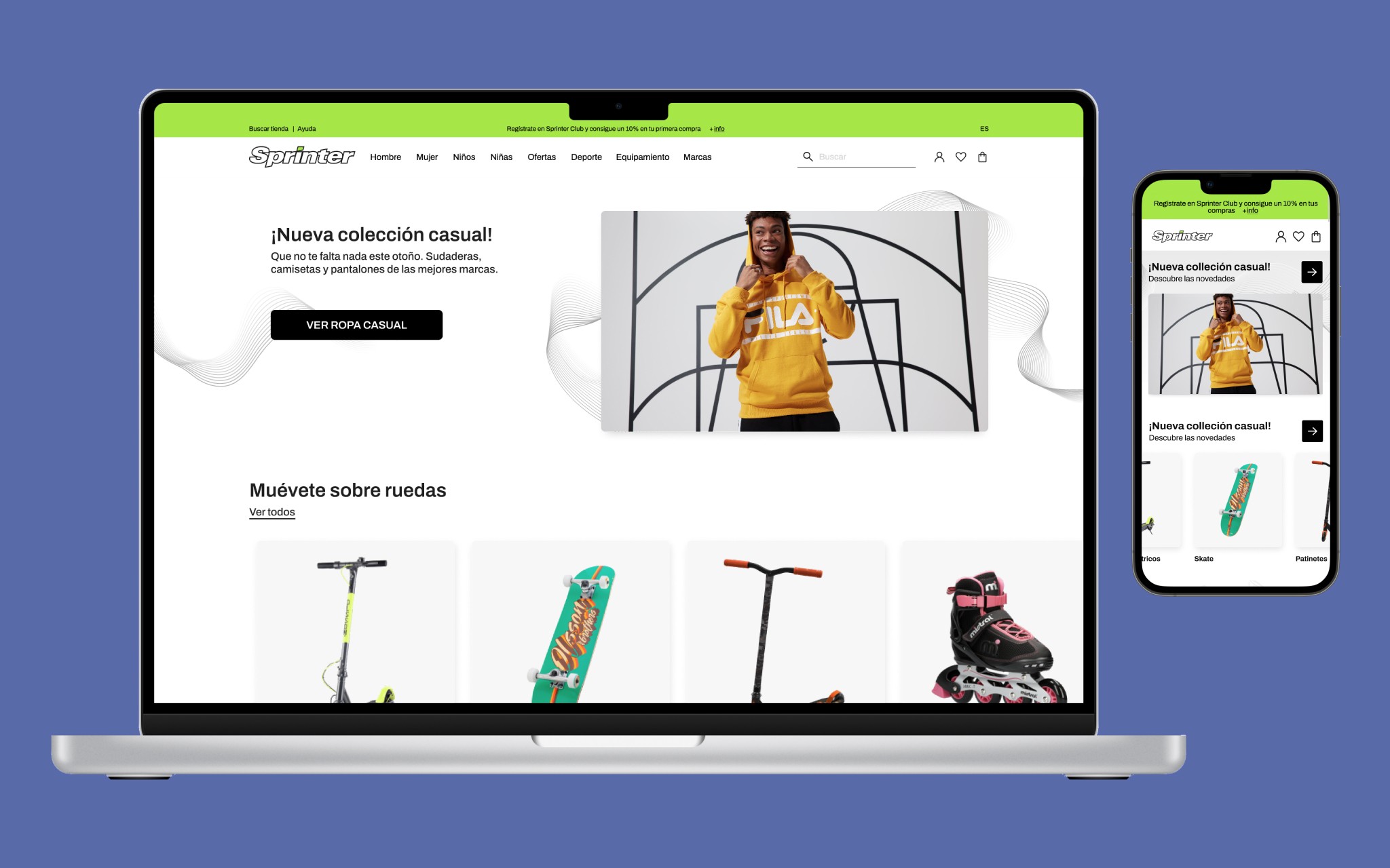
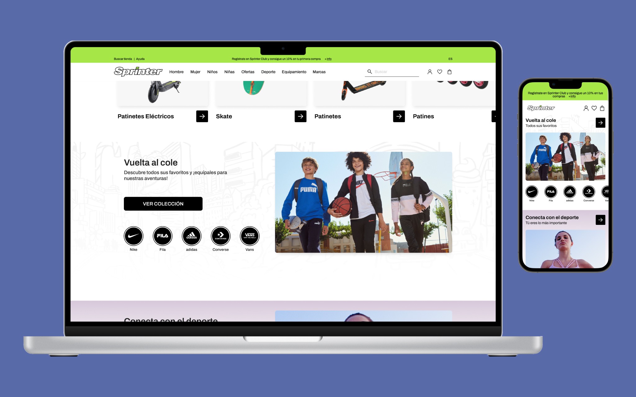
The E-commerce home page represents one of the main entry points for users and, even if we took care daily of keeping it aligned with sales trends, we also refresh it visually on a monthly basis. With this frequency, we were able to keep it eye-catching for returning visitors and apply any time-sensitive campaigns. As a design lead at Sprinter, I was accountable, among other things, for the design and maintenance of this page. The following designs have been slightly edited to include the most recent font updates.
Added value
UI & Interactions
Team management
Creative direction
General details
E-Commerce
Deliver every 3/4 weeks
Deliverables
UI Design
Prototypes
Documentation
Tools (main)
Figma
Hotjar
Empathise
UNDERSTANDING BUSINESS PROBLEMS AND OUTCOMES
The business need was to provide data-driven and visually appealing access to products. The expected business outcome was to deliver a friendlier shopping experience for users, that would help to reach sales objectives and targets.
The main challenge I encountered while working on these projects was related to time constraints and last-minute changes due to marketing and sales-related needs. The outcome on our side was to react promptly and provide solutions that could be implemented easily without losing a minute. Timing matters!
The solution was crafted in close collaboration with the front-end team to create reusable components that could scale and adapt to any marketing need, with an extra focus on the website's performance.
The three main points we considered were:
Responsive mobile design. How would the design adapt to smaller screens?
Scalable and modular elements. Is it possible to create valuable variants from the base component?
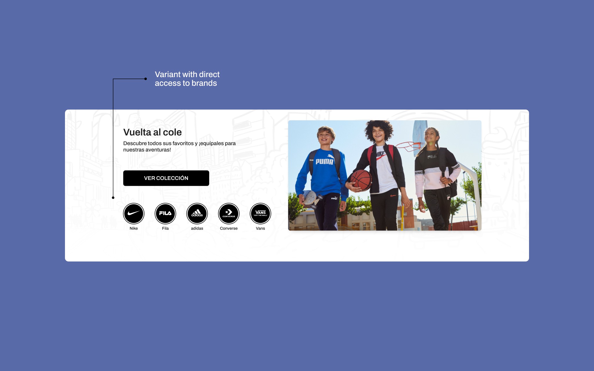
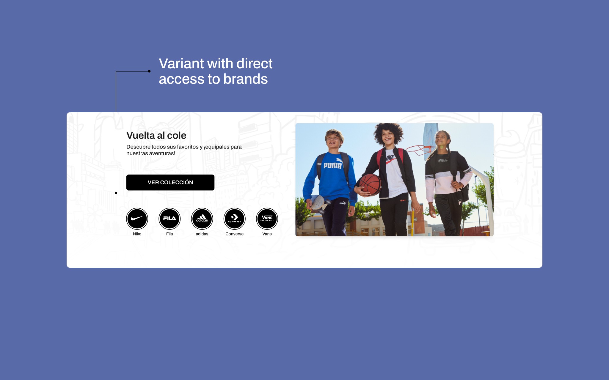
Clear, and eye-catching visuals. Can the component include eye-catching assets and images with low effort?
The synergy between aesthetics and functionality is crucial for this project because we need to provide a dynamic, aesthetic, and efficiently designed E-commerce home page.
Define & Ideate
cross-functional teams collaboration
The home page(s) we crafted was the result of great teamwork among three teams: Design, Performance and Photography. Thanks to this close collaboration, we were able to define data-driven structures, complement them with eye-catching images, and organise all the content into a component-driven layout that would load at a glance.
As design lead, I was in charge of coordinating teams and efforts to obtain the expected outcomes. The creative direction for the shootings was a joint effort of the design and photography teams.
Design
components, structure & aesthetics
From the website analytics, we learnt that the vast majority of users navigate and browse via mobile, although the conversion rate is much higher on desktop. Users browse and discover using their mobile phones, but they buy using desktop devices.
On the other side, clients can be roughly split into two main categories:
General public. People who are just interested in casual streetwear garments and/or are approaching some sports activity but have no or low technical knowledge.
Mid-level sports experts. They know what they are looking for, and they need quicker access to products and product sub-categories.
With this information upfront, we defined a modular structure to use and combine two levels of hierarchy to match our public needs and keep things flexible:
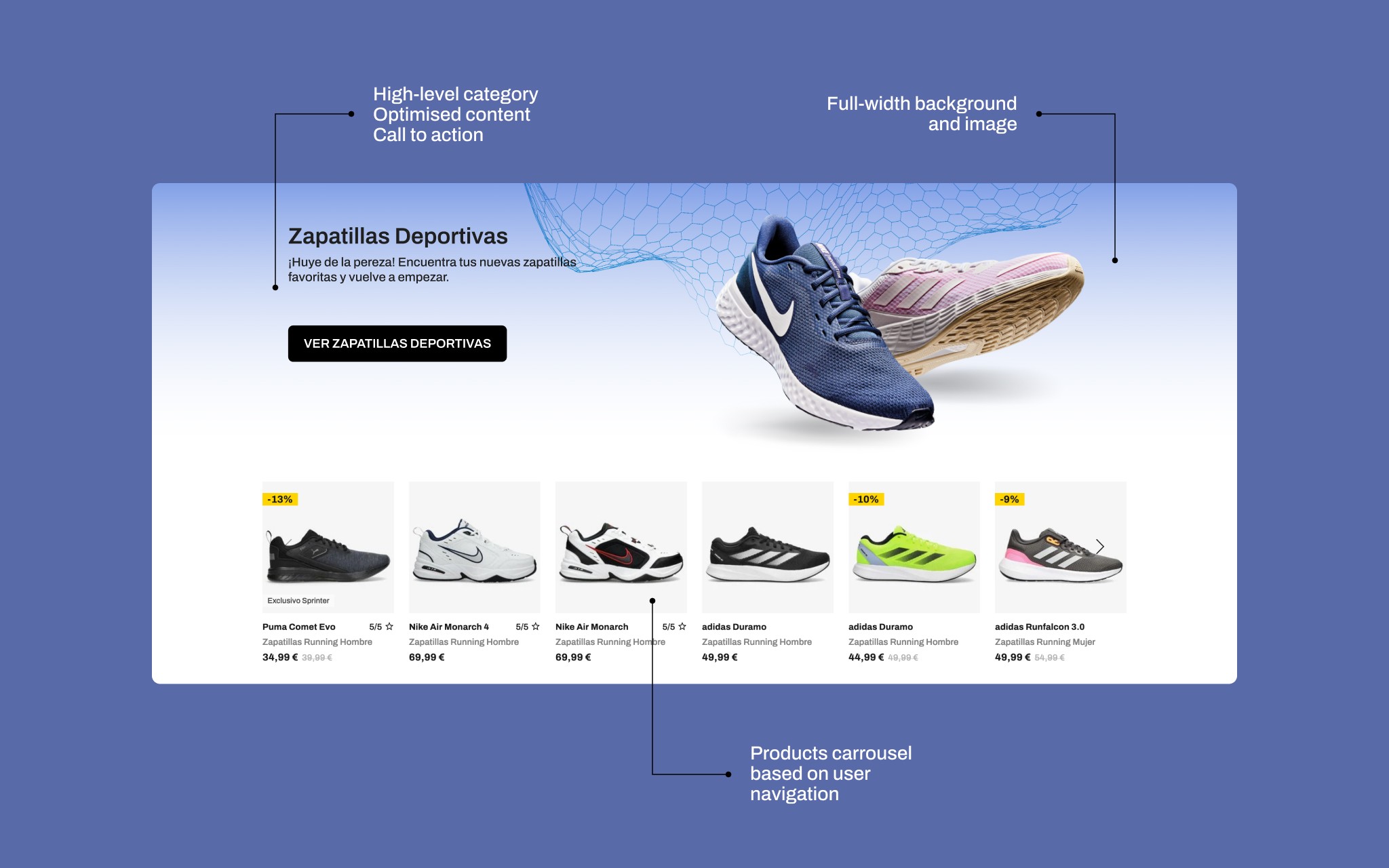
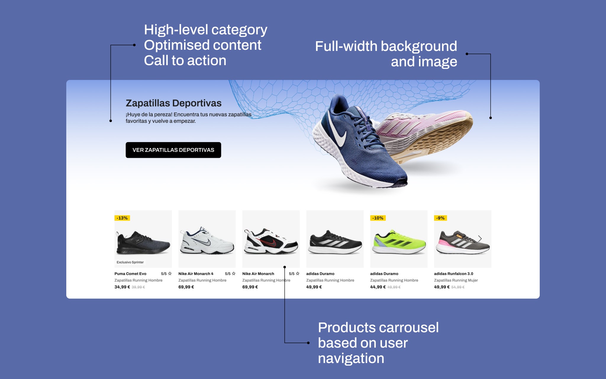
High-level categories → provide entrance to the main product categories of the sitemap such as Casual footwear for example.
Sub-categories or products → give access to more detailed sub-categories such as brands, product types, or product carrousels.