Sprinter Pass is a subscription-based streaming platform of sprintersports.com. The product itself is hosted with an OTT platform service, outside the e-commerce domain. The objective of this project is to drive traffic to the platform, taking advantage of the great volume of active users in the E-Commerce.
Added value
UI & Interactions
Design Lead
Team management
General details
Streaming platform
Landing page
Deliverables
UI Design
Prototypes
Documentation
Tools (main)
Figma
Hotjar
Rationale
imagery AND DESIGN DECISIONS
Sprinter Pass is meant to help people live healthier and more active lives through personalised nutritional plans and training videos (live and on-demand). The user personas are people who have limited time or non-conventional schedules but still want to take care of their body and their minds. Even though the project started as a small side programme, the (in)famous COVID-19 and the lockdown landed in our lives and the platform lived a huge rise in demand during 2020 and 2021.
With this context, and following landing pages' best practices, we decided on the following:
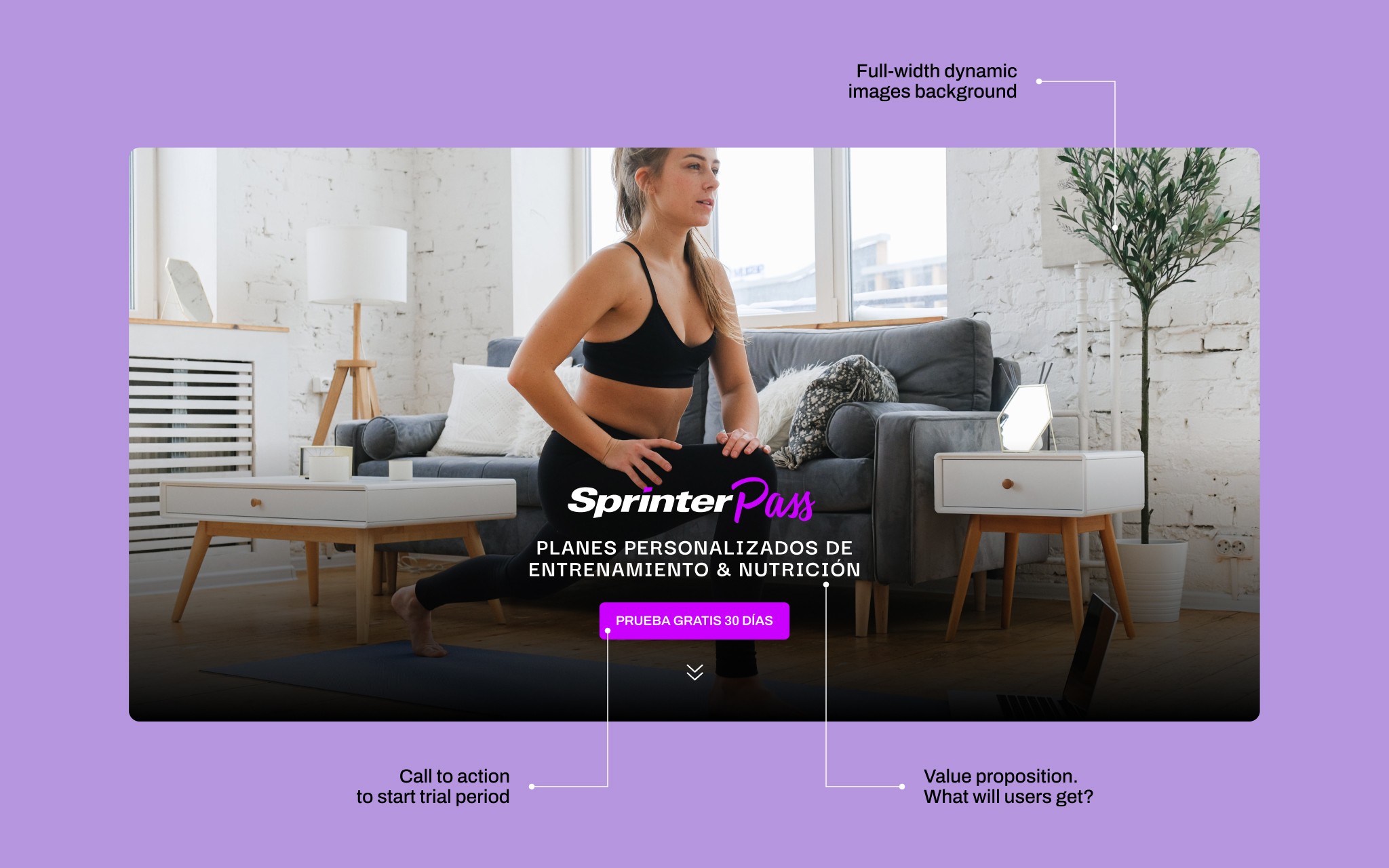
The hero section must include a vídeo or a set of images. We want this section to be dynamic and display people with whom potential users can identify and relate.
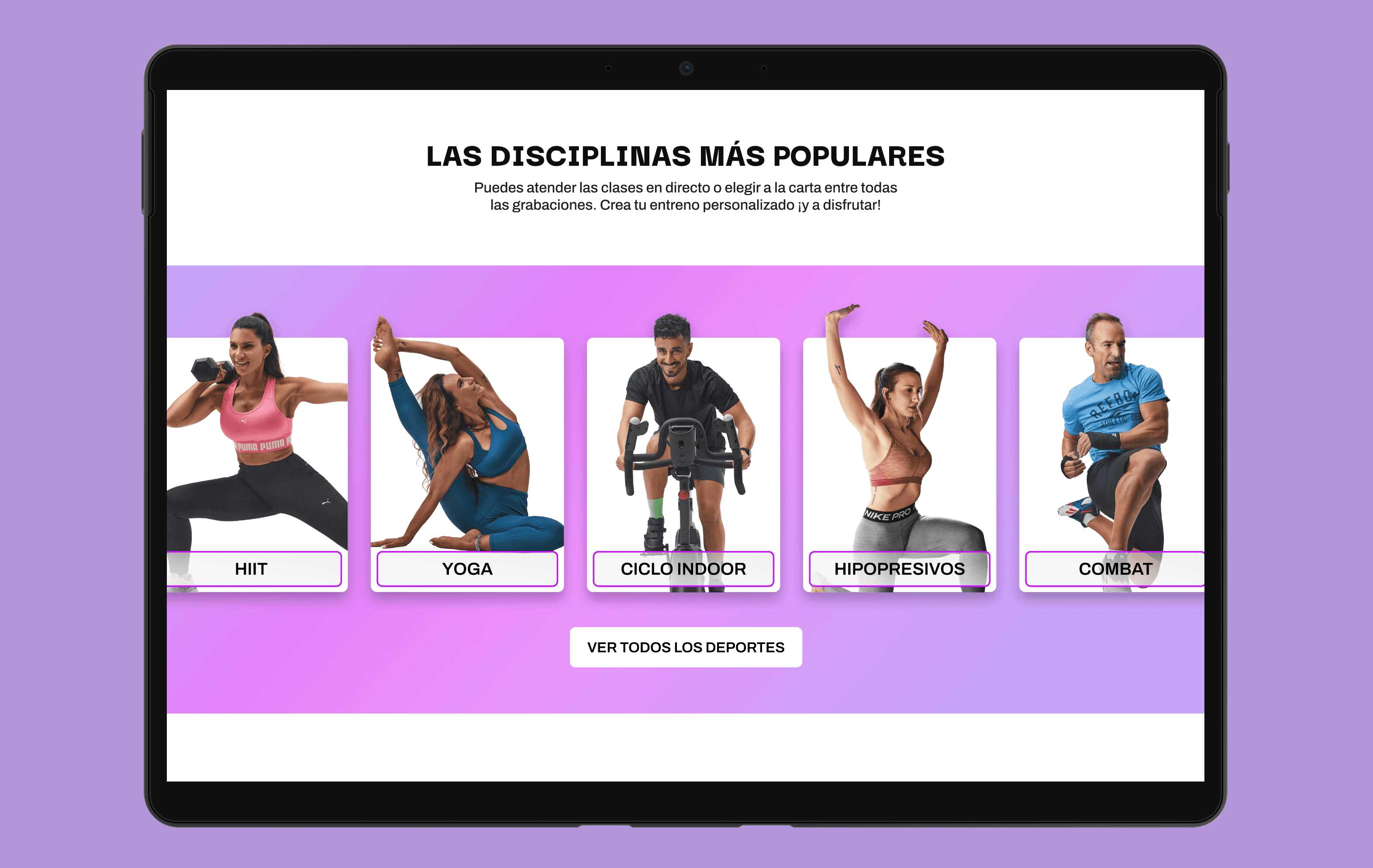
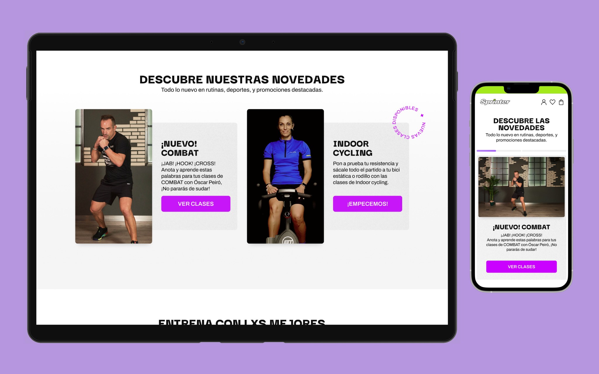
We will not produce images to promote disciplines using classic models or stock photos. We'll use real-life trainers from the platform to show users and potential users their value and level of seniority. In addition to that, these professionals have active social communities which will undoubtedly provide an amplifying effect in terms of communication and brand positioning.
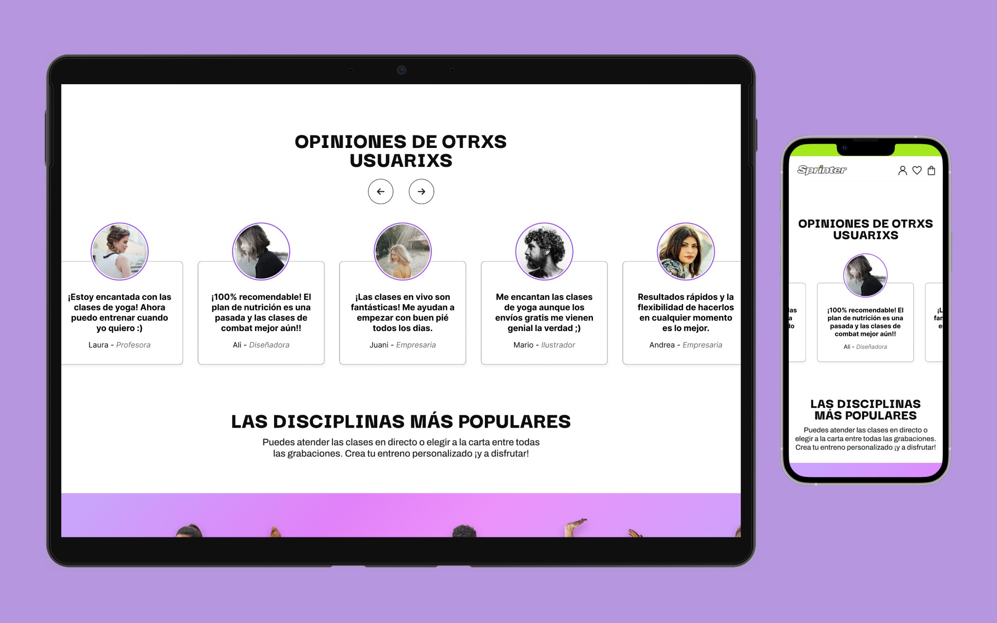
We'll display real-life opinions of the platform. Social proof is rooted in behavioural psychology, and it's been scientifically proven to increase landing page conversion rates.
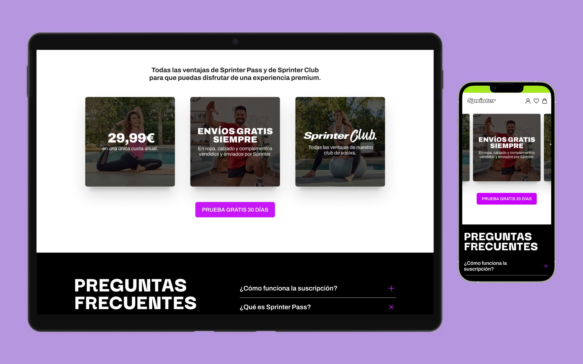
Clear, and meaningful FAQ section. The platform was relatively new and we must make sure that users dissipate any doubts they might have.
Design
sections and general layout
The hero section displays multiple images of users-alike people, states a clear proposition value, and provides a unique call to action for users to subscribe. The 30-day trial text as the button content amplifies the sense of control for users, allowing them to opt out whenever during this period without paying anything.
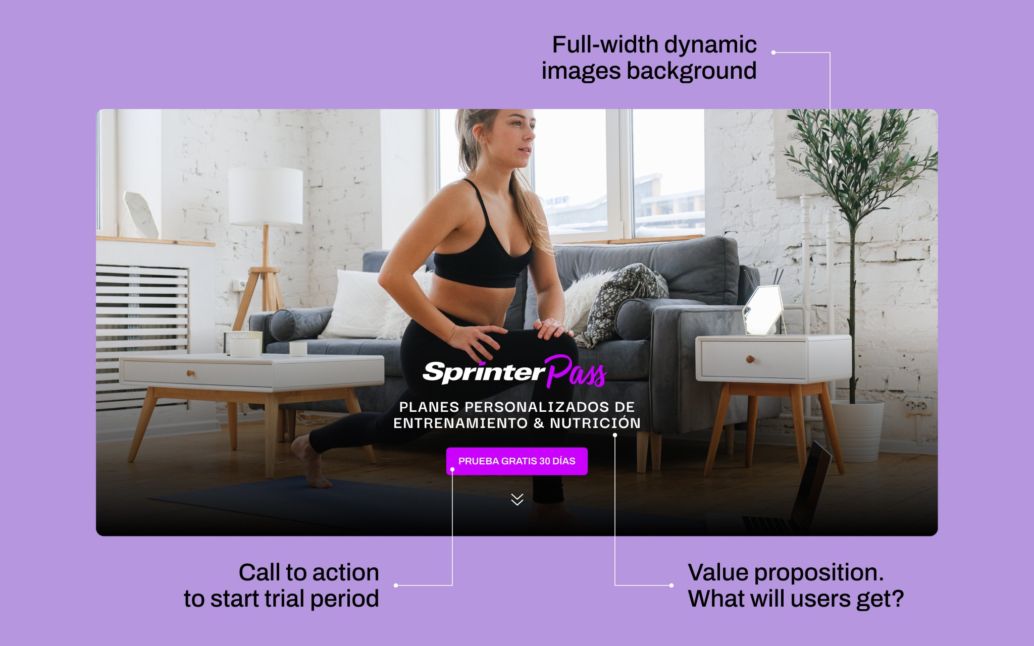
The first section lists the latest news, classes, and new trainers. I designed as well a circular animated text badge to add a second layer of highlight whenever this is needed. This element is meant to draw the attention of users and it's used throughout the whole landing page as it can be added to any element.
The rest of the page provides social proof using real-life opinions, authority through professional trainers' photos, and clear information via visual summaries and FAQ questions.